
Wishes portrait in progress 6 - Using my "swatches map"
- Kevin Roeckl
- May 28, 2025
- 4 min read

I had to create a “swatches map” to understand those tricky and deceptive values in Wishes’ face. I first showed you my swatches-map in the previous post, while working on the black parts of her face. Now I'm moving on to the rust parts.
It’s even more challenging than the black parts of her coat.
Not only do the values (the lightness/darkness of a color) have to be very precise – barely different from the paper color – but the colors do too. I'm no longer working in shades of gray, I'm working with – – – what color? Our eyes see orange and rust-brown…but is it really?
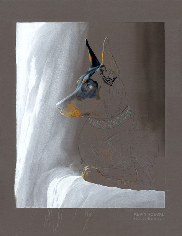
1
The whole portrait as it looks now, as I get back to work on the rust part of Wishes’ face.
2
To help me understand the colors and values in the rust part of Wishes’ face, I created what I call a “swatches map”. First I sampled the colors with Photoshop (the squares of color on the reference photo on the left). Then I copied those swatches and moved them over to the right, on top of the paper color I’m working on.
Now I can see what colors they actually are. Deceptive isn’t it? On the reference photo they look like fairly vivid oranges and red-browns. But when you see them isolated on the dark grey, they barely stand out from the dark grey paper. (If you squint your eyes most of those swatches disappear in the grey.) These are extremely muted colors.

3
The pencils I pulled out to achieve those colors. The closest I could find to the colors on my “swatches map”. Only 3 of them are a close match.

4
Swatches made with those pencils on a scrap of the “Dark Grey” Canson paper. I needed to see how the pencil pigment looked on that paper color. Most of them are too vivid: too light in value, or the color is too saturated, or both. I will have to blend two or more pencil colors to get the muted tones I need in the artwork.

5
This is where I was at when I started work in the studio….
In my last post I described how I got the values and colors for the black part of Wishes’ face, and her nose - which had to transition to lighter and lighter values as I went from her eye area down the bridge of her nose. And the pale, muted colors at the front of her rust muzzle that you see here. Very tricky colors — not brown, not orange, not grey.
There is no actual black in this portrait yet, except for the back side of that one ear.

Today I want to complete the rust area that makes up the rest of Wishes’s face. It too has to transition from light values at the front of her muzzle (the part that you see finished in this pic) to darker and darker as it goes toward her neck.
6
Very few of the colors on my swatches-map for Wishes’ rust area, matched a single pencil color. Most of the colors I’m creating on the artwork are a blend of 3 or more pencil colors. Plus the paper color, which is allowed to show through in various proportions. Instead of using grey pencil to blend with these oranges, mauves, and rust browns, I use the paper color itself.

7
A close-up of the pencilwork. You can see where I’ve lightly put down mauve, then layer different shades of orange and burnt ochre (rust) below the black part of her face. And quite a blend of colors on the muzzle where the whiskers come out on the left. The edges where her black coat meets the rust, involves some chocolate brown and deep Tuscan red. There is not a sharp edge between the black and rust markings. The black hairs of the dog’s coat overlap with the rust-colored hairs. I’m not portraying every hair. I just portray the transition of colors.

8
The side of her face finished (whew!), and joined onto her lips which I had completed previously.
I work in sections, finishing out the values and colors, before going on to the adjoining section. I tend to fill in lighter areas first, as you see here, as I move into the next adjoining section, her neck….

9
…then the darker/shadowed areas - under her jaw and throat. They require more layering of multiple colors, and blending them smoothly into the lighter tones.
I continue adding the edges of her black coat as I complete the rust areas on her neck. Making sure my dark-brown and grey values are correct where they join the rust area. I am still not using any black. All the “black” parts of her coat on her face and neck at this point are dark greys (cool and warm greys), Sepia, and Ultramarine Blue. I’m just about to transition into true black on that edge you see on her forehead and on her neck. There will still be lighter values (very dark greys) to give shape to her anatomy, but the darkest values in the remaining parts of her head and neck will be the blackest black I can get.
I worked all the way across Wishes’ face and head from the lightest values on her nose, going steadily darker and darker, before finally reaching values dark enough to be black halfway around her neck.

10
The next day I did the other ear. I love the way it turned out.
But I’m jumping ahead…. I’ll make another album to show you that ear next.

🎨 Prismacolor pencil and acrylic wash on “Dark Grey” Canson Mi-Teintes paper, 20 x 26 inches.
Commissioned by Alicia McCarthy


Comments