
Wishes portrait in progress 5 - A precarious challenge
- Kevin Roeckl
- May 20, 2025
- 5 min read

In previous posts I talked about the challenge of the values in this difficult piece. In my last one I shared why capturing the watchfulness in Wishes’ eye - the essence of who she was - is absolutely essential to this piece. So I have the double challenge of capturing that eye with all the depth and meaning that is important in this portrait….with those challenging values that have to be spot-on to make the piece look correct.
Find out how I did it....
1
Capturing Wishes’ watchfulness - the essence of who she was - is absolutely essential to this piece. That watchfulness is embodied in her one eye, truly the “window to the soul”. Along with that challenge, the values (the lightness or darkness of a color) in this piece have to be spot-on to make the whole artwork look correct. Doing her eye was a tense day in the studio.
This is the result.
What did I have to do to get here?

I chose to work on “Dark Grey” Canson paper for this piece. In my earlier posts I explained why. The main value of the scene, a dim room lit by hazy light from the left, was dark grey. To capture the mood, the values of a black Doberman, rendered mostly in shades of grey transitioning to lighter and lighter grey toward the left, have to be precise. If they are “off”, Wishes won’t look like she is “in” the scene.
2
Wishes’ eye is the centerpiece of the portrait. Identifying the values accurately so I can find the right color pencil to use, is extremely important. Working on a very dark grey paper fools the artist’s perception. Are they lighter or darker than the paper? Or are they the same value as the paper but bluer or redder?
To identify the values in the reference photo, I created a “swatches map” with Photoshop. This is the eye area of my reference photo. Except for the highlights on the eye, almost the entire thing looks “dark grey”. But yet it has forms. The curves and hollows of her face that are indicated by lighter and darker values. Forms that are critical to capture in a portrait.
With Photoshop I sampled some areas on the eyeball and the eye-socket around the eye. You see those sample swatches (little squares of the sampled colors) overlaid on the eye in the left half of this pic. I then duplicated that exact configuration of swatches, and moved it to the right on top of a rectangle of the same grey as my paper. Now I have a “map” of the values in the eye-area, to the right of the eye area.
When you look at those value swatches on the dark grey of the paper, you can see why the values in this piece are so challenging. They hardly differ from the paper color. (And now you can appreciate why I chose that paper color. The paper does most of the work for me.)
By switching this “swatches map” on and off with Photoshop on my reference photo while I’m working, I can see exactly what values/colors are in and around Wishes’ eye.
I didn’t bother sampling the highlights on her eye. I can identify those myself without help. They are white and pale beige.

3
The artwork.
This required an extremely light hand with the colored pencils. The values – lighter and darker – were barely different than the paper color.
I chose this paper color so the dark gray would do a lot of the work. I had to keep backing off and letting it do that. Instead of covering every speck of the paper tooth with pencil. The paper itself gave me the color I needed. There was no need to apply it with pencil pigment. Only the very lightest application of pigment to tone or tint the paper color.
Except in Wishes’ eye itself, where the solid black and bright white are what make the eye look shiny and alive. There I applied the color firmly and precisely, completely covering the paper tooth.

4
These are the pencil colors I was using. The greys and muted browns, black, and white, are for the black parts of Wishes’ coat, her nose, her eye. The oranges, mauves, and rust browns on the other sheet of paper are for her rust markings.
When I worked on the eye itself, I zoomed in quite a bit on the monitor so I could see the details clearly.
My computer keyboard is near my left hand so I can quickly switch my “swatches map” on and off while I’m working.

5
After I created the eye and eye-socket area, I continued working forward down Wishes’ muzzle toward her nose - the black areas of her coat, not the rust, not yet.
This was the particularly tricky thing about the values in this piece that I described in my previous posts where I showed the wash of white paint that created the lighting effect: the values in Wishes’ whole face get lighter and lighter as you go toward the left, toward the light.
THAT’S what gives this piece it’s “mood”.
I completed the “black coat” down the bridge of Wishes’ nose, and joined it to her nose itself (which I created before I even did the white wash in the background). That nose, which we know on a black Doberman is a black nose, is actually light grey.

Then I began on the rust part of Wishes’ face, starting at the farthest left where it’s the lightest value. What color is that exactly???
Check it out. (Next pic)
6
This is my “swatches map” of Wishes’ face, made with Photoshop on the reference photo.
I don’t think I could have captured those tricky colors and values on the rust part of her face as accurately as I did without this.
In the previous pic (Pic 5) I showed you the little bit of rust area that I had started directly below her nose, and asked you what color you thought it was. I would have answered “gold”. Now look at the swatch on this swatches map. The swatch where the rust area starts below her nose on the left…and the corresponding swatch on the swatches-map on my paper color on the right.
Are you surprised?!

7
Very tricky colors.
Very tricky values.
If you squint your eyes you will see that the orange/rust part of Wishes muzzle that I’ve completed in this pic, is almost the same value as the dark grey paper behind it. Or to be more precise, the dark-grey-paper-lightened-with-white-wash, behind it.
I matched those very muted muddy browns on the “swatches map” as precisely as I could. Yet the result, to our eye, looks like the gold and orange tones of a Doberman’s rust areas.

8
This is how the whole portrait looks now. (Below)
The “orange-ness” of her muzzle is a little alarming. But I trust that my colors and values are right, because of how I identified what pencil colors to use. I will continue on with the rest of the rust area on her face. I may have to adjust the colors and values a little after her whole head is finished. Adding the darker greys and black of her upper head and neck will make all those lighter values look different by comparison.
Values are always relative, in artwork. They are relative to the colors and values around them.
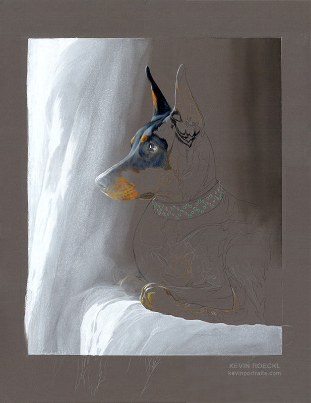
🎨 Prismacolor pencil and acrylic wash on “Dark Grey” Canson Mi-Teintes paper, 20 x 26 inches.
Commissioned by Alicia McCarthy


Comments