
PART 2 - Scout portrait in progress - start to finish
- Kevin Roeckl
- Nov 10, 2025
- 23 min read

Portrait of Scout continued from PART ONE
Scout portrait in progress 9
I’m not going to add the colored pencil grass details around the Frisbee figure until I finish the barn-hunt figure. The backgrounds of those two scenes - straw and grass - will have to fade/blend together at the edges. Since the portrayals of Scout are the most important thing, I want to finish the barn hunt figure first. Then create both the straw and grass backgrounds around the two action figures. Any background scene I put in has to enhance the figures, not the other way around.
I’ll need the figures completed to be able to judge what I’m doing with background shapes and colors.

Scout portrait in progress 10
But first, I had questions for Annette.
My email to Annette:
"The layout we chose is balanced and visually pleasing. It wasn’t until I made my initial outline drawing on the Canson paper that I was struck by the amount of open space in the lower right corner. Nothing wrong with that but I’m turning my attention to that now. I was thinking about how much (if any) lights and darks I want to do to suggest detail in the straw.
So my question is, do you have a preference about whether there should be some kind of space where the rat is located, or shall I just make the whole area “straw”? Should there be an indication of straw bales with a space in between them? I’m not familiar with barn hunt and the kind of hardware or other things that are involved. In the reference photo there is an orange object in front of/below Scout’s nose. That color would not work at all, because a bright orange will draw the eye, and we have that orange Frisbee perfectly placed in the center of the composition with the Frisbee action pose. What is the purpose of that orange object in the barn hunt photo? If you want I can make an “edge” of straw where it drops off (where the orange object is) with some wisps of straw hanging over that gap. In other words, keep that gap in front of and below Scout’s face --- which I assume is where the rat is hidden? — but with an edge of straw over the top of that gap instead of the orange object. That would give us a darker area at the bottom (just to the right of center) of the composition, which would work fine. Then "straw texture” would pretty much fill the lower right corner. That’s where I’ll sign my signature.

Annette replied:
The orange is a foam tube slid over the edge of a piece of plywood that is placed across the opening between 2 bales of straw to create the opening of a tunnel. Going through a tunnel is a requirement and the tunnels get longer with more turns as the level of difficulty increases. It is to protect their heads. I did notice the space you are referring to and your idea of bales of straw is good.
Scout is searching for a tube containing a rat that is hidden in the straw. He uses scent & needs to discern tubes that are buried containing bedding from the rats but no actual rat. If he alerts on that it disqualifies the run. OR if he fails to find a tube with a rat in it or exceeds the time limit that is also a disqualification.

2
A rat (housed in a small aerated INDESTRUCTIBLE composite tube) is buried deep in the straw (between bales or underneath piles of loose straw). There is no visible opening - the dog must displace the straw to uncover the tube and then paw it or give some signal that it has a rat in it. Hopefully, the dog is right! The handler then calls out "rat" and the judge either confirms it or not (you are now disqualified). Scout has a perfect record in that regard. He has moved from Novice to Master rank without ever alerting on an empty tube but he has missed a tube with a rat two times in all those titles (Novice, Open, Senior and Master).
Each title requires a specific number of qualifying runs. At all but the Master title, the handler knows how many rats are hidden but at the Master level he/she doesn't know. That requires the dog to let the handler know there are no more rats by giving a signal - Scout's signal is to come to me and lie down. Again, if the dog is wrong then the run is disqualified. Scout has only missed 2 times - he found all the rats but wouldn't quit hunting and time ran out (he doesn't like to give up if there are only 1 or maybe 2 rats). I disqualified us a few times by making a handler error 😖 Scout is now working on a Champion rank that follows Master.

3
“I think it would look nice to use some straw to fill the empty space. I am attaching a picture of our home practice area (above) that shows a tunnel entrance. I defer to your judgement as to how to add some straw = scattered or a bale(s). Is there enough space to fit a bale in? I will like whatever you decide!”
4
“While I am busy doing my job as a handler, I miss Scout’s expressions which really are of intense concentration. He uses "air scenting" to hone in on areas to search. This does require a lot of focus and it is easy to see the difference in skill and ability when watching multiple dogs. Some lose interest quickly and some go right past the hide - even after sniffing the area. Scout is hypervigilant and will go over every inch before giving up. ...This pose is going to bring a new element to our story....it portrays his problem solving and thinking skills that he doesn't need for frisbee (just athletics there)! I just love how we are capturing so many of his personality traits.”

Working on Scout’s “barn hunt” figure….starting with his beautiful big fluffy tail.
Scout portrait in progress 11
In the following pics you can see why I masked off the figures to protect the grey paper when I made the underpainting for the grass and straw. I wanted to utilize that grey paper in creating Scout’s coat in all three figures.
1
I started with his fluffy tail and am working downward.
Scout’s black coat is made up of many shades of grey….very little actual black.

Working on grey paper means I don’t have to cover the paper as solidly as I would if I were working on white (or some other color like tan or green paper). I don’t need to cover the “tooth” of the paper - the little bits of paper that show through colored pencil - in the areas where there are light and medium greys. It’s OK if that grey paper shows through the pencil strokes. It’s the color that works for what I’m adding there with my pencil colors.
In other words, the paper color saves me work.
3
White hair is easy to do, using white and light grey pencils, since the paper provides the shadows between the hairs.

4
The pencil colors I’m using for Scout’s coat. Just about all the greys that Prismacolor makes. French greys, warm greys, cool greys, slate grey (a very blue grey), black, and white.

I’ve finished most of Scout’s black coat. His legs are white. His head will be black with a white blaze. Scout’s face will be extremely important to what makes this scene: his expression of intense concentration and focus.
Scout portrait in progress 12
It took quite a while to do all of Scout’s black coat on his body. Now I’m on to the left front leg. That’s where I really use the grey of the paper to give me the color I need.

The white front leg is more shadowed than the white ruff on his neck. I used white pencil for the ruff. For the forelegs I’m using pale grey pencils (French greys, which are warm, and cool greys) to make some strokes of hair, but mostly it’s the color and value of the paper itself that is showing there.
This close-up is a great example of how I use paper color to do a lot of work.
You can see it as the shadows between the strands of hair on his foreleg, and notice how much paper I leave showing in places.

Annette commented:
“Oh my...I never would have guessed that the grey is actually the paper coming through between the hair strokes! It looks so much like his coat I thought you had used pencil - a fine balancing and use of medium!"
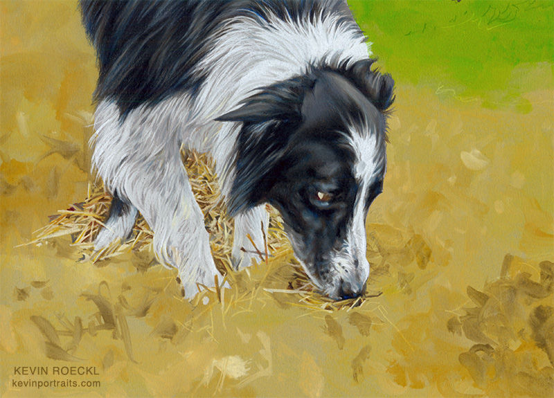
As I am doing his feet, I’m starting to put in some of the details of the straw around them.
Note the straws around his feet and under his chest.

As I finish the edges of Scout’s coat, I add the straws that are overlapping or adjoining those edges. My gold underpainting makes that easy. It gives me an “under-color” the same way that pale grey gave me the under-color for the pencil strokes of hair on Scout’s front leg. It saves me work of trying to cover up the grey paper with golden/yellow/orange/brown tones. That was the whole reason for making an underpainting for the grass around the Frisbee figure, and the straw around the barn-hunt figure.
Making the details of grass blades and straw blades will be easy with colored pencil strokes on those green and gold base colors.
This is how the whole artwork looks now.
Scout’s barn hunt figure is starting to come to life.

I slowed down and became particularly focused when I got to Scout’s face. This is where I stopped for the day. That look of intense concentration is very important to the barn hunt pose, and to capture his involvement in the work he’s doing. That will “make or break” this barn hunt figure. I’ll continue on that tomorrow when I’m fresh.

Scout portrait in progress 13
1
Doing Scout’s forehead.
His smooth head that makes you want to kiss it.
The little creases in his white blaze on his forehead are extremely important: tiny details but they show his intense concentration.
2
It took me a while to do those shapes in his white blaze. Very slow and painstaking like doing an eye, with a glance at the reference photo every couple of seconds. In this face it is not just the eye that is making the expression. It's the shape of his brow: the eyebrows, the shape of the coat on his forehead, which is most visible by the shapes in the white blaze. It’s kind of an odd collection of shapes there. It wasn’t until I began focusing on portraying it that I realized how much that little area of his white blaze contributes to the expression of concentration on his face.
To get an expression on a face, it's important to focus on what it is that makes that expression.

3
There are a lot of details in Scout’s muzzle. This shows how I put in the darks and lights in the muzzle area. Then fill in the mid-tones around them, blending everything together as needed. And in some places I leave the grey paper color showing, that's the color I need there. Or lightly darken or lighten it, if needed.

4
You’re seeing close-ups of Scout’s face, but as I am working, I am considering the look and context of the whole figure. And also, now, the straw — around him and under his nose. Scout is interacting with the straw.

5
All of his focus is in his nose.

Here’s what Annette wrote, after seeing these in-progress pics:
“While I am busy doing my job as a handler - I miss his expressions which really are of intense concentration. He uses "air scenting" to hone in on areas to search. This does require a lot of focus. Scout is hypervigilant and will go over every inch before giving up but I am more alert to watching his body, keeping up with his fast pace and making sure he has looked in all the corners as he zooms around the field. So I miss the detail on his face. What a joy it is to have it highlighted for me!”
6
Scout’s barn hunt figure is now finished.

Scout portrait in progress 14
Scout’s head in the barn hunt pose was slow going because it was so important to get his expression just right. I had enough time and energy left the day I finished his face to start putting in the straw around the figure. That goes much more quickly. It’s not necessary to be precise to what is in the reference photo.
Scout portrait in progress 15
The two action figures in Scout’s triple portrait are finished, and now I have a decision to make: Should I finish the grass around the Frisbee figure first, or the straw around the barn hunt figure? Pic 1 explains why that decision was important, and the rest of the pics show how I resolved it.
1
At this point the backgrounds are just flat color, no detail. I need to decide whether to keep “building out” the straw from the edges of the barn hunt figure where I added some around Scout’s legs….or finish the grass around the running Frisbee figure first.

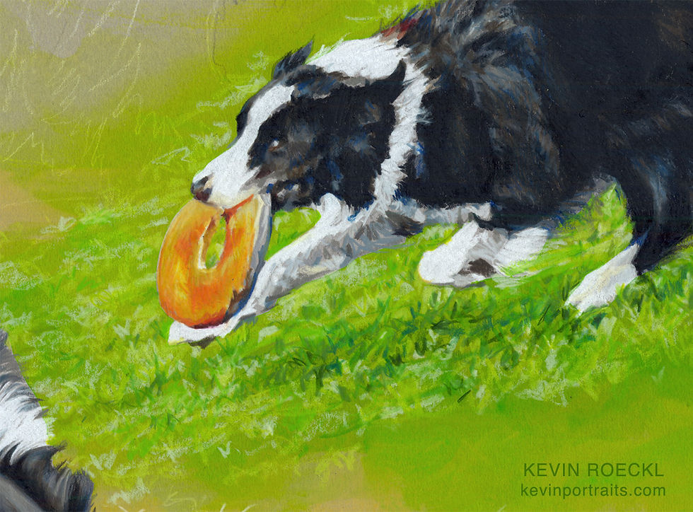
I have decided to do the grass next, and complete the Frisbee scene. I created that Frisbee figure in a “fast ’n loose” style with quick, impressionistic strokes, including some diagonal lines coming off the back of Scout to give a feeling of speed. I plan to continue diagonal lines in the grass - the shadows under the figure and the streaks of grass texture - as though he’s running downhill - in that same loose, impressionistic style. Those diagonal stripes will touch the shoulder of the barn-hunt figure. Bold diagonal lines give a dynamic feeling to a composition, a feeling of tension and excitement. But diagonal lines are not something to add lightly to a composition: they are strong features.
Since those diagonal stripes in the grass scene are important to the overall look of the portrait, I want to complete that next, so I’ll be able to judge as I’m working on the straw, how the straw scene works with the bold diagonal lines, the lights and darks and grass texture of the Frisbee scene.
Like many colored pencil artists, I tend to work on small areas at a time. But it’s important to also look at the overall effect as you work and consider the artwork as a whole.
2
Before I started on the grass I wanted to indicate some of the straw around the barn-hunt pose. So I could visualize how the two areas would meet up.
You may know that I project my figures to make outline drawings on the Canson paper at the beginning. I leave my projector set up in that exact position until I finish a piece, in case I need to project again. (It’s very hard to get the image precisely the same once it’s moved.) I expected I might do that with the straw. I fired up my projector and used cream pencil to put in a few highlighted straws with cream pencil, as you see here. The straws are larger at the bottom of the artwork (closer to the viewer) than they are behind Scout’s body (further away). These bright straw lines give me some guidance on the size my straw strokes will need to be. And enough of a visual to help me see how the green grass will look where it runs into the straw.

3
I created the Frisbee figure in a looser, more impressionistic style. So I create the grass in a similar style. I also wanted to exaggerate the diagonal lines. I made more streaks of grey and black coming out of Scout’s hind leg and tail, and matched the angle with streaks of green in the grass. That gives a sense of “tension”, or excitement, and also the sense of how fast Scout is running; a sense of motion. This shows the grass while in progress, haven’t yet finished the lower part where it meets the straw.
I wanted some fast music for this day’s work. Usually it would take me more than one day to complete a large grass area, working in a painstaking detailed style. I wanted to complete this in a single session, keeping the momentum of fast and loose and very energetic. For the soundtrack I returned to Jesse Cook - the music I listened to while doing Scout’s running figure - fast Spanish guitar with clapping and high-energy guitar riffs. I loved the energy and rhythm of it for this passage - I wanted to move as fast and energetically as Scout running, to capture his speed and athleticism. I actually worked up a bit of a sweat doing this!

4
This closeup detail shows how fast and loose the pencil strokes are.
It’s important not to overwork this impressionistic style. I could not have done this without having the green underpainting to tint the grey paper. (Or work on green paper). This loose, “scribbley” style lets a lot of the underlying paper color show through.
5
This close-up really shows how quick and loose my strokes were, on Scout and the Frisbee, as well as the grass.

I call that my “Little Jewel” style because it usually contains jots of bright, jewel-like colors, like blue on the edge of Scout’s black fur, bright red on the bottom of the Frisbee, emerald green in the grass. I offer a "Little Jewel" portrait type, my most affordable portrait category.
6
The Frisbee scene finished. Where the edges of the grass meet the gold underpainting, the green underpainting did a lot of the work of the fade-out. I just threw down some very fast “grass-blade” scribbles that escaped the edges of the green area to tie it to the barn-hunt straw. It's really important not to overwork that. I want the pencilwork in this loose style - especially for this energetic action scene - to look spontaneous.

I rarely work standing up, but I did the Frisbee grass standing so I could put a lot of physical movement into it. It may be surprising how much of their whole body an artist can put into their work - even with colored pencil.
I also wanted to stand because I needed to see the entire artwork to judge how this large grassy area was working in the overall composition, and how to fade out it’s edges in context with the other figures. I get a better view standing up looking over the whole artwork than when I’m sitting down and bending forward to work on it.
7
I went ahead and signed it too, while I was in that high-energy, fast-n-loose mode. I like to sign my work when I’ve been working and my hand is “loose”. Otherwise my signature looks “stilted". (Probably nobody would notice that but me.)

FOR ARTISTS:
When I’m going to be signing over a busy, detailed area (straw, grass, foliage, etc) I sign first, and then work the details in around my signature. Otherwise, if I’ve put down a heavy amount of colored pencil for the details, it “repels” the pencil I try to sign over it. With Prismacolors, a wax-based pencil, you can only build up so many layers. I plan ahead for where my signature will be.
Annette wrote:
“The portrait continues to be perfect - every decision you make and the resulting detail have been absolutely "spot on" in bringing Scout's "being" to life. I hope you are taking great satisfaction and finding much happiness in Scout's masterpiece!”
Scout portrait in progress 16
This shows my technique for making straw. A whole lot of it.
1
I've finished the Frisbee scene, and put in a bit of the straw detail around Scout’s barn-hunt figure on the gold underpainting. Now I I have a whole lot of straw to fill in. There will be a tunnel entrance where you see the darker brown splashes of watercolor at the bottom of the composition. That was done way back at the beginning with my gold/brown underpainting.
2
I’ve been working on a tutorial for how to make grass, I have a technique which can create large areas of grassy lawn pretty quickly. Straw is done basically the same way. Except using a different set of colors (golds/browns instead of greens). And like with grass, the key is working on the right background color. That's why I did an underpainting of yellow-ochre across the lower part of Scout’s portrait, to cover the grey paper.

When I took this pic I had added a few highlighted straws, by projecting the barn hunt scene and tracing just the brightest straws with cream pencil.
3
That’s to give me some guidance about the size and randomness of the straw, and the size of the straws in the foreground (larger) vs the ones behind Scout (smaller, further away).
This is exactly how I start my grass technique. Cream pencil strokes for the brightest grass blades. But on green paper, instead of gold. And the grass blades are more upright….they don’t go in as many different directions as straw.

While I had my projected image on the paper, I also threw in a few of the darkest shadows between the straw with chocolate brown and rust pencils. You can see those throughout the right and bottom areas in this pic (above). Notice how crudely I’ve jotted those in. The straw does not have to be precise like Scout’s coat and features.
4
These are the pencil colors I’m using for the straw. I don’t need mid-value yellow ochre, because the underpainting gives me that. If you follow my work you know I use paper color to save myself a lot of work. I have light colors for the highlighted straw strokes, and darker colors for the shadows between straws.
My light colors are cream, beige, and pale yellow-ochre. Dark muted orange, dark yellow ochre, greyish mauve, and a variety of medium-value browns and rust pencils — for the darker spaces between straws.

5
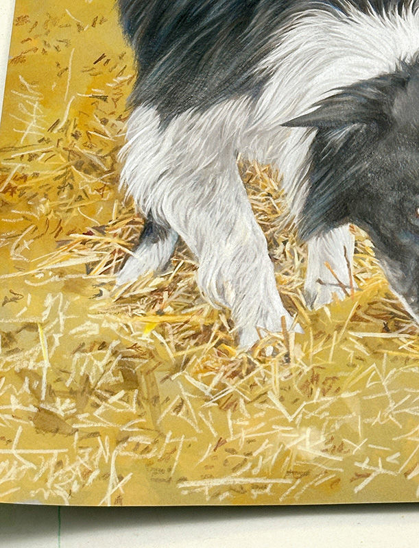
I start by making the straws that are touching Scout’s figure: around his legs and head in this pic. I have to go pretty carefully there because I don’t want to be doing fast, scribbled strokes and have them accidentally overlap the precise edges of his finished fur.

Also I make certain that wherever a straw shape meets the edge of Scout’s figure, it’s either lighter or darker than that edge, so Scout stands out crisply and cleanly from the straw. More crisply and cleanly than in the photo. (See next pic.)
At this point I’ve pretty much finished the straw that is directly adjoining Scout. Now I'll just keep working outward from there, adding onto the finished straw in sections, finishing each section before adding the next. The farther I get out from the edges of Scout, the more fast and loosely I work. Once I’m clear of the figure’s edges, I can throw down fast, random strokes to make the straw texture, with quick slashes of colored pencil.
I’ll say it again, the straw doesn’t have to be done with photographic precision, to look like straw.
7
The technique I use, which is the same as my technique for doing grass….is to start with cream-colored highlighted straws or grass blades. In this before-and-after pic below you see how that looks.:
In the before pic my cream highlight straws. Then I progress through my pencils from lightest to darkest. With my light colors - the ones lighter than my gold underpainting - I add additional straws. Slashes of beige and very pale grey-brown. Not as light in value as the highlighted cream straws, but lighter than the background color.
As I work my way through my mid-value colors (yellow ochre, orange, mauve) I put some of them exactly over the bright cream straws. That creates a color that’s a blend of the two. So all my highlight straws are not just the same cream color. Some are light-value orange, yellow, and a buff/mauve color.
Finally I come to my darker-value colors: dark mauve, rust, light umber (greyish brown), and chocolate brown. Now I add those IN BETWEEN the lighter slashes I’ve made for the straws. These become the spaces between the straws. Some of those “shadow-spaces” shapes, I trace precisely against the bright edges of straws. Others I just throw down jots of pencil randomly but more or less in the spaces between straws.
The result looks like this. On the left is the gold underpainting with cream highlight straws. And a few jots of shadows-between-straws.
On the right is the completed straw, after I have worked through my pencils from lightest (slashes of straws) to darkest (spaces between straws). The darker the pencil, the fewer the jots and dashes I make. I don’t want to end up with a bunch of chocolate-brown straw.

8
Here’s what the pencilwork actually looks like.
Toward the bottom you see how loose my strokes are. This was easy to do because of my yellow-ochre underpainting. That underpainting has saved me a WHOLE LOT of coloring-in every single speck of grey paper with yellow-ochre and brown pencils.

9
Here’s another section showing the before and after progression. The top pic shows my highlight straws done with cream pencil on the gold background. In the bottom pic you can see where I exaggerated the cream highlight straws, added other light straws, and put in the jots of darkness between them with a variety of orange, rust, and brown colors.

As I mentioned, I “build out” the straw in sections. The previous sections around Scout’s legs and the entire bottom left corner of the artwork were finished. This was the next section I added onto those. This takes me to the top edge of the tunnel. My next section will be the straw next to Scout's forehead. Lastly the darker interior of the tunnel. I’ll do that the same way, but with more of the darker pencil colors.
10
The pencilwork below Scout’s nose. It’s very scribbley.

11
I also added the section behind Scout on the far left. That is a much darker section where the side of a straw bale is in shadow. I did have to use a lot of brown pencil here. I made the straws the same way with my lighter colors, but with a higher proportion of the darker-value colors. Then rubbed over all of that straw-texture lightly with Light Umber (mid-value grayish brown) pencil to darken it even more.

I also highlighted the top of that far-left bale. Just some slashes of cream and beige to make highlighted straws on that useful yellow-ochre underpainting.
12
I’ve finished another “section” of straw — this one to the right of Scout’s head - to build out the straw across the artwork going toward the right. This is as far to the right as I’m going to go with straw detail.
Why?

--- Filling the entire bottom of the artwork with straw detail would make it unbearably "busy". The busy texture of the grass and the busy texture of the straw… it would just be too much.
--- The shape of the straw bales and the tunnel make enough of the barn hunt scene around Scout to tell the story. That's all that is needed. I don't need to fill the whole bottom right corner with straw. The subtle variations in the underpainting are enough to keep it from being too flat and boring, and the color tells the viewer that straw continues.
--- I don't want anything in that lower right space that would pull attention away from Scout’s figures.
13
This is how I’ve faded out the straw. You can really see how my gold underpainting does so much of the work.

I sent pics to Annette and wrote:
“Here’s the latest. Tomorrow the tunnel entrance. You can see where I’ve put the highlighted straw hanging over the top of the tunnel.”
Annette replied:
“Beautiful!! Yes - I see the beginning of the tunnel edge. What an unexpected detail to further enhance the hunt setting!! I never imagined straw could be so involved!”
14
Lastly, I add the tunnel. I had most of my darker values there already, since I had planned that darker tunnel entrance into the composition, and when I did the underpainting I splashed some brown watercolor into the wet yellow-ochre wash to create some random darker shapes. You saw that in the previous pics.
I knew that (being a wash, not a strong opaque color) that brown would be lighter than my strong brown pencil colors. I wanted to be guided by that lighter brown underpainting as my correct “dark” value. I very emphatically do not want a very dark shape at the very bottom edge of the composition, taking attention away from the black Scout figures. Because black figures are so strong visually, I don’t want any values that are even close to that degree of darkness, to compete with the impact of black-and-white Scout.

So I carefully controlled myself when I added these dark brown “shadow shapes” between the straws inside the tunnel with pencil. I allowed myself only a few, and did not let myself overwork it. There are a few dark sepia brown and chocolate brown shadow-shapes just under the top edge of the tunnel where the bright straw overhangs it….and a few dark shadow shapes at the very bottom of the artwork. I could almost count those bottom dark shapes on one hand. I limited myself very strictly. Note how those dark shapes “lean” toward Scout’s face. Almost like they are pointing at him. Putting such a dark hole that low in the composition was something I did carefully. It’s entire existence had to be about Scout.
15
I have only one thing left to do now. Finish the neck and shoulders of Scout’s head study. I’ll fade it down into the two action scenes to tie all 3 figures together.

Scout portrait in progress 17
When I was adding the colored pencil to connect these two scenes, fading the straw of the barn-hunt scene into the grass of the Frisbee scene, it was necessary to see the entire composition as a whole. So when I finished adding the straw in a way that felt like it looked good, to check whether it needed anything more I taped the artwork up on the wall of my studio, and stood back to see what the artwork would look like as the client would view it in their home.
I saw then that I needed to bring the green of the grass down a little further into the straw color. I do that with the artwork taped up (normally I work on a flat table), putting in a few strokes, stepping back to see it from about 8 feet away, stepping forward to add a few more where they are needed, and I keep that up until I have it looking just right. I wouldn't be able to get the big picture leaning over the artwork looking at it from 18 inches away.

The neck and shoulders of Scout’s large head-study are still left to do. When that’s finished I’ll repeat this process of taping the artwork up on the wall and stepping back to see if it needs any final touches. That’s the very last step in creating the portrait. When I step toward it for the last time and take it down from the wall, it’s finished.
Scout portrait in progress 18
I’m now working on the final part of Scout's portrait.
Once again you can see how I make light-colored strokes for the hairs with white and light-grey pencils, and let the paper color create the shadows between hairs. In most of this triple portrait, I used the virgin grey paper color to do that. For this head study I deliberately wanted the underpainting (the paper color tinted by transparent green and gold watercolors) to show through, so Scout’s coat looks like it’s fading down into the barn-hunt and Frisbee scenes rather than just into grey paper.

Scout portrait finished
Below is what Annette wrote about her partnership with this amazingly accomplished Border Collie.

Prismacolor pencil and acrylic wash on “Flannel Grey” Canson Mi-Teintes paper
20 x 26 inches.
Annette wrote:
“Scout has been an incredible addition to my life. I met him as a 5 year old, recently retired from a busy working life as a goose hazer protecting workers from angry geese. I have had 3 previous Border Collies but Scout has expanded my understanding of being a team and communicating in ways beyond anything I have previously experienced. He is never far from my side, won’t go outside without me, and many people, including my trainer, have commented that he is always looking to me for direction. I don’t think I have a single picture of us together where he is looking at the camera instead of up at me.
Scout has an abundance of skill sets. He has done advanced tracking and is very good at scent work. We are trying our hand at agility where he is hampered by my inexperience as a partner but still has progressed to the Intermediate level. However, his 2 passions are Frisbee and a sport called Barn Hunt. One Christmas I put sleigh bells on the front door handle and within 2 weeks he linked that sound with going outside to play Frisbee. So I left them up and now he will ring them when he wants to play – about every hour or so! In Barn Hunt, he excels at finding the target tubes hidden in hay and has never alerted on a decoy. He currently has a Master rating and is going for his Championship rank.
Scout is a very friendly and mellow soul. His natural ease and friendliness make him a hit in therapy work, especially with children. We visit in many venues from hospitals to libraries to nursing homes. His behavior has at all times been flawless. In fact, I have never had to correct him for anything in any setting. He seems to sense the temperament of each person – not overwhelming the tentative or frail adult but playfully responding to an enthusiastic child.
I have not had the extra years together that would have come if our journey had started when he was a puppy. Therefore, I treasure every moment. I feel a connection with him that is unique. He seems to understand so much that is spoken and unspoken. As he studies my face and watches my eyes, I believe he has a special awareness. His eyes are so intense and communicate so much. When he wants something, he will look at me until I start to follow him. As he leads the way, he constantly looks back at me until we arrive at his destination. Yes, he is very smart, learns quickly, enjoys puzzles and challenges which is great fun. But what I treasure most is the emotional bond and connection we have.
Every day creates a new memory and it is hard to pick “favorites”. I have never done dog sports or worked together with my dog as a team so it has been a great thrill to build this partnership. I have been spoiled by the ease with which he masters activities, new roles and sports. I don’t know how many blue ribbons we have but it is considerable. However, the joy of working as a team is greater than any ribbon.
As the day comes to a close and he is finally willing to put his toys aside, my favorite time begins. He crawls in his bed, waits for me and we have some precious (and sparse) snuggle time. He then puts his head down, closes his eyes and waits for the morning to eagerly wake me up for another day of adventures! This nightly ritual will linger in my memory always – I believe above all the other joys we share.”
Annette and Scout:


Triple portrait of "Scout".
Scout’s Chase RATM RATCh ThD
Commissioned by Annette Riehle.
🎨 Prismacolor pencil on “Flannel Grey Canson paper, 20 x 26 inches.
Reference photos:
Head study photo by Faith Lyman, barn hunt photo by Jackie Singer, Frisbee photo by Donna Childs.


Comments