
Wishes portrait in progress - start to finish
- Kevin Roeckl
- Jul 28, 2025
- 28 min read

Wishes' portrait will be a challenging artwork. It’s not a complex piece, but it is a challenging one because of the values. (Value = how light or dark a color is.) This portrait actually has very little color in it. The composition is simple and straightforward. The values are what make it difficult.
This is the photo that Alicia loved the most of Wishes. I’ll explain what makes this so difficult to capture.

You might think at first what makes this piece challenging is that it’s so dark. And that’s true: the values of Wishes and the value of the blanket behind her barely differ from each other. It’s not like portraying a black dog on a white background. I will be portraying a dark grey dog on a dark grey background.
But that’s not what makes it so hard. What makes this piece challenging is that the grey background is light grey on the left (not counting the white sunlight on the fabric), transitioning gradually to darkest grey on the right. That’s what gives the hazy light effect, the soft light coming in from a window on the left. And if that was the only problem, I’d create a light-to-dark background, and do a black dog on it. But what really makes this challenging is that the values of Wishes also transition from light grey on her nose, to darkest grey (not quite black) on her shoulder on the right.
To your eye it looks like her nose is very dark grey, because we “know” she is a black dog with a black nose. Later I’ll show you how light a grey her nose really is. The hazy lighting effect has to transition gradually across Wishes too, just as it does across the background, from left to right.
How to do this with colored pencil?
It's not a piece for beginners.
2
The first thing I did was decide what paper color to work on. I chose Canson’s “Dark Grey”. It’s the same value as the background above Wishes’ forehead. That’s the predominant value in the piece.
Then I spent a couple days identifying the values with Photoshop. This shows my Photoshop layout: Alicia’s photo of Wishes on the paper color I plan to use, with the background greys pulled out so I can see them: See exactly what shades of grey those are, on my base color of the “Dark Grey” paper.

So far this is all just in the computer. I knew how challenging this piece was by the number of hours I spent trying to thoroughly understand the values using the tools in Photoshop. There were messier layouts than this before I created this simple “road map”.
Once I understand what I have to achieve, I plan my strategy with art materials.
3
Whenever I start a new artwork, I plan a "strategy". Because of the materials I use, certain steps have to be done in certain orders. That varies with each artwork, there is no set formula, because each artwork is unique, and my materials are used in different ways depending on what the image calls for.
This album shows the steps I started with, to capture those challenging values in Wishes portrait.
I plan to do a white watercolor wash across the dark paper from left to right, to capture that transition from pale grey to dark grey, the soft lighting coming from the left. But first I’m putting down white pencil where there are highlights on the blanket. I’ll explain why….
Here is a pic I took in the studio, with Wishes’ photo on the monitor to guide me.

4
I dug through my bucket of pencil stubs to find the White ones. Since they are too short for my electric pencil sharpener, I used a utility knife too expose more of the white core so I can get more out of them. I don't need a sharp point for what I'm doing. I don't WANT a sharp point. I want a flat, dull point for making broad pencil strokes.
In this picture you can see two of my "pencil extenders", one with a pencil stub in it. Pencil extenders are extremely handy for getting the maximum life out of expensive art pencils, when they’re too short to hold comfortably.

5
I’ve now completed the white pencil work. As you can see, I put in the highlights from sunlight on the fabric, and marked the folds for some of the other fabric under Wishes with light grey pencils. And I’ve added the highlights and outlines on Wishes’ face and front legs.
Except for the little bits of color that I had to include on the highlighted edge of Wishes’ face, I am working only with white pencils. There is a reason for that. My first step for this piece is to do a watercolor wash of white paint from the left edge of the image, fading out as it goes toward the right. That will give me that transition of values all the way across the piece from pale grey at the left to the dark grey paper on the right. But before I could do that “first” step, I had to know where to fade that transition. (Partway across Wishes’ face.) So I had to put in the pencil outlines for the whole portrait to know where to put the wash of white paint. And because the white paint will be thicker on the left, it will be hard to get really solid pencil over it, pressing hard to get solid pure white. But if I put solid white pencil down as heavily as I can (with those sturdy little white pencil stubs) on the virgin paper, going over the top of it with white watercolor won’t change any pencil colors. White watercolor over white pencil will only make the white more pure. So I only used white pencil. Any other colors I might have used to start that transition across the piece, such as light grey, will be changed when I put white paint over them. But for the white pencil, I WANT the white paint to make it even whiter. Colored pencil artists probably know that it’s not possible to get a true white with pencils on dark paper. The white paint over it will get me there though.

That shows the whole sheet of Canson paper (20 x 26 inches) with the 16 x 20 crop lines marked out, the size Alicia ordered. At the end, if it looks good, I’ll give Alicia the option to keep the entire sheet as part of the artwork, or have me trim it down to just the 16 x 20 image.
I always work on the full sheet and trim it down at the end. Sometimes the image looks cool “floating” in the center of the larger paper. Canson Mi-Teintes is a beautiful paper.
6
In this closeup you can see my outline drawing, done with pencil colors similar to the areas I’ll be filling in — light grey, and orange pencils for Wishes’ lighter highlights and rust markings, green pencil to mark the green rhinestones on her collar. I use appropriate colors for my outline drawings so I don’t pollute the pencil colors I’ll be adding later by doing black outlines.
The highlights on the front of Wishes’ face are the beginnings of her portrayal. Why did I do that step now, before the watercolor wash is put in? Because the light wash of white paint will cover and hide those very faint outlines I’ve made on her lower face. This gives me a road map, not only for the colored pencil work I will do later for her portrait, but also to guide where to fade out the watercolor wash going from left to right. I intend to fade the wash completely out about halfway up her face (where her muzzle meets her eyes).
Part of the strategy I thought out in advance. When working with mixed media, figuring out which steps to do in what order.

7
Painting day.
I’m using acrylic paint thinned with water (like a watercolor wash) to do the light coming in the window on the left. I can get that hazy light effect more smoothly with a wash than trying to do it with colored pencils, where it’s hard not to have visible pencil strokes. Here’s a pic I took in the studio today. The reference photo of Wishes is on the monitor. The tray with 4 wells to the right of the artwork has 4 mixtures of paint. They all look white, but each one has more water than the last, so it’s more transparent. That’s how I get a smooth gradation of wash that has more white paint in it on the left where the light is brighter, to thinner and thinner mixtures (more water, less white paint) as I go toward the right, where it fades out midway up Wishes’ muzzle. That gives a nice effect of hazy light. I also used the white wash on the blanket below her, fading to darker (thinner wash) toward the bottom right corner.
I have the 16 x 20 taped off with painter’s tape (the blue tape) and aluminum foil to cover the outer borders of the full sheet of paper. After I pull the tape off, the image will be in the center of the dark grey paper. As you can see, I’m using some really big brushes to do the wash. The sponge (green sponge) is to wet the left side of the paper before I put down the wash, so it flows more smoothly on the paper. This paper is made for colored pencils and pastels, it’s not a watercolor paper. So it doesn’t really take watercolor washes as smoothly as watercolor paper would. The paper is too absorbent and the paint doesn’t flow easily on it. But over the years I’ve learned a few tricks to get closer to the effect I want.

Wishes’ folded front paws and back leg are covered with masking film (adhesive translucent film) that I cut with an x-acto knife to meet the edge of the blanket below her, so I can do that smooth wash without getting any of the white wash on her paws and legs. I’ll peel that up when I take off the blue painter’s tape.
I’m also going to do a thin wash of black on the right side of the image, where the lighting fades more into darkness. Just to darken the grey paper a bit more on the right. (Wishes will be dense black so she will stand out from that.)
Wishes portrait in progress 2
The next day I did the same thing with a wash of black paint, darkening the right side of the scene.

Here it is with the tape removed. Now I have my values for the background. Those values will dictate the values I use for Wishes herself.
Monitor is shut down for the day, paintbrushes cleaned up. Paper has to dry overnight.

As you can see, the paper is buckled from being wet. This paper is not made to handle watercolor washes. I have a process for flattening it, by wetting the entire back of the paper and then pressing it under weights for 48 hours. It’s difficult to work with pencil going over those hills and valleys, compared to a totally flat piece of paper. Hard to get smooth pencil strokes.

I don’t enjoy mixing and using paint, but I love working with colored pencil. I don’t have confidence with paint. I have total confidence in my abilities with colored pencils.
Wishes portrait in progress 3
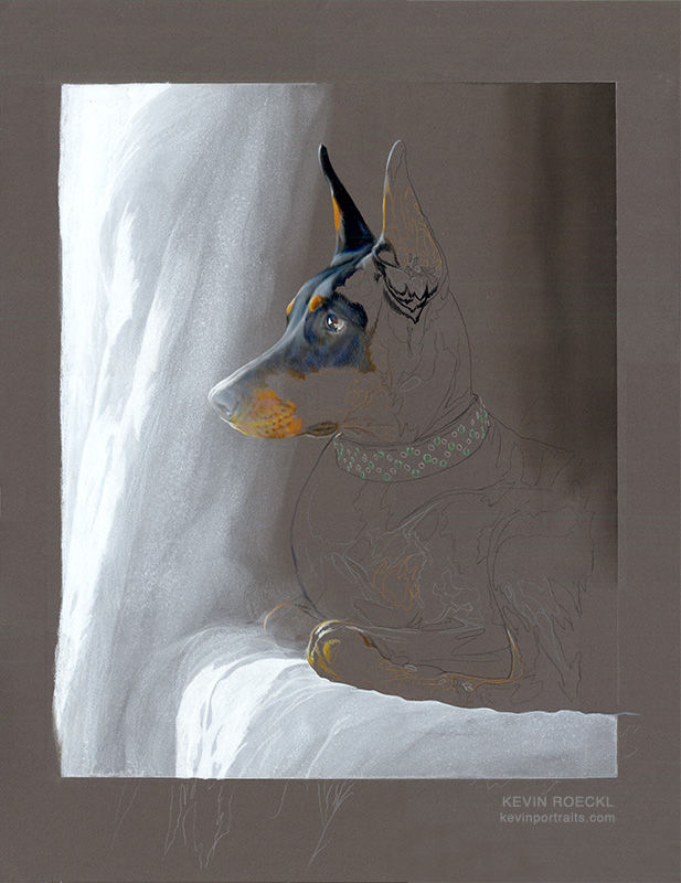
This is how the whole piece looks now. Wishes is already present on the paper, because of the colored pencil work I did before creating the wash across the background - values that will dictate everything I put on top of them with colored pencil.
Because of those initial colored pencil highlights and outlines, now I can clearly see where to start working on her.
And the fabric is 99% finished. Other than the initial white pencil highlights, the white wash did all the work on the fabric.

Wishes portrait in progress 4
The values will continue to be challenging as I work on Wishes. Her whole face has to become gradually lighter as it extends toward her nose, into the hazy light that gives this piece it’s mood.
I've showed you all the steps it took to capture the unusual lighting. It took all those steps to get to this point, establishing the values on a sheet of dark grey Canson paper — from white on the left to black on the right. Those values will now dictate the values I have to use to portray Wishes.
1
Wishes’ reference photo is on a monitor in front of me, and I’m getting the pencil colors I need lined up. I’m testing them with swatches on scraps of the same “Dark Grey” Canson paper, to check how each color works on that dark grey. Working on colored paper changes the color of the pencils.
The swatches on the right show how the different Prismacolor greys look on this paper. Cool greys, French greys, and Warm greys. Those will be the colors I use in Wishes’ black coat.
The swatches on the left show the colors I’ll be using for Wishes’ rust markings. 23 different pencil colors.

2
The highlighted front edge of Wishes face was already in place. I needed to do that before I could put in the wash of white for the lighting.
I start by working on her ear.
In the reference photo, Wishes is darker grey on a dark grey background. She barely stands out. But this is a portrait. I want Wishes to stand out clearly.…while still keeping that soft, hazy lighting effect. So I will exaggerate the dark and light values of Wishes to make sure she stands out from the background. Yet all the values of Wishes (a black and tan Doberman) have to also fade from very light on the left of the artwork, to darkest on the right edge of the artwork. The “black” on Wishes’ face will not be as dark as the “black” on her shoulder.
I started with this ear because this ear is a reference point for my values. All of the values on the front half of her face will be lighter. All values to the right of it darker, going to pure black by the back of her neck.
This ear is actually dark grey, not black. This piece is so tricky because the values look very deceptive to the eye. Your eye….and MY eye as I was working on it. I had to continually check the values against reference swatches that I had made on the reference photo. (I’ll show you those in another post.) This ear looks black because it’s a much darker value than the dark grey behind it.

3
I intend to start at Wishes’ nose and work up her face. All of the values on her nose and lower muzzle have to be very light. They have to match the value of the lightened background. I did the background first because I wanted lightened grey paper behind Wishes’ muzzle, as you see below. I will use that lighter grey paper to guide the correct values for Wishes' nose; I'll match it’s value so Wishes’ nose and muzzle barely stand out. That gives the hazy lighting effect.
I am having to use extremely light pressure with my pencils. The lightest I can possibly do and still lay down color/pigment. I keep the color values very faint to maintain that hazy light effect across the front of Wishes’ face.

It looks to you as if Wishes’ nostril is black and the front edge of her nose is light grey. But in reality - the colors of the pencils in real life - those dark and light values are both barely different from the (lightened) grey paper beneath them. The fact that they are different from eachother gives enough contrast to have lights and darks, in the places I need them. Notice the blue-grey at the upper right of Wishes’ nose-leather, is the same value as the paper color.
Yet that is the black nose of a black dog.
Wishes portrait in progress 5
Next I work my way up the front of Wishes’ face, making the values more pronounced as I go toward the top of her head: the lights lighter and the darks darker. (More contrast between the lights and the darks.)

I intend to do Wishes' eye next and I need a place to attach it. Now I have her rust eyebrow. I’ll work from there around the eye socket area, and then the eye. Those values will be tricky too.
Her one eye that's visible is critical in this portrait, because Wishes’ entire heart and soul was about watchfulness.
This is how the portrait looks now:

Wishes portrait in progress 6
Wishes’ eye is finished.
Wishes whole heart and soul was about watchfulness. All of that is captured in her eye. Below is part of what Alicia wrote about that.

“Dobermans are described as watchful and alert and that was Wishes, she was always listening and watching. When we traveled, she would not lay down to fall asleep in her crate but would watch out the window the whole time, even on trips that were 10 or more hours. Whenever she was in her soft crate, she liked the top open so we could sit or stand and watch everything but never tried to escape even when left unattended for long periods of time. At one scentwork trial I had to leave to go do something and told everyone she will be fine but if she tries anything to go ahead and zip her in. When I returned, they had taken some great pictures of her and said once I left the room her eyes never left the door until I walked back through it.
Unlike Titan she was not showy and didn’t seek attention or want all eyes on her. She preferred to be the one doing the watching and not being watched. I think she truly believed the camera would steal her soul and hated to have her picture taken. All her best photos were always side profiles or ones she didn’t know her picture was being taken.
She was stubborn when she REALLY didn’t want to do something but would do pretty much anything I asked her to. I often wondered after she was diagnosed with cancer and was going through chemo if I should retire her, and asked several friends and judges if they thought she was still enjoying the game or doing it because I asked her to. A few judges who were also friends told me it was both, but saw how much she adored me and how she looked at me and watched me. I don’t think I ever saw it at the time but looking back at photos and videos that were taken of the two of us together I have been able to finally see what they saw, and the feeling was mutual.”
Wishes portrait in progress 7
In previous steps I talked about the challenge of the values in this difficult piece. And why capturing the watchfulness in Wishes’ eye is absolutely essential to this piece. So I have the double challenge of capturing that eye with all the depth and meaning that is important in this portrait….with those challenging values that have to be spot-on to make the piece look correct.
Here's how I did it....
1
Capturing Wishes’ watchfulness - the essence of who she was - is absolutely essential to this piece. That watchfulness is embodied in her one eye, truly the “window to the soul”. Along with that challenge, the values (the lightness or darkness of a color) in this piece have to be spot-on to make the whole artwork look correct. Doing her eye was a tense day in the studio.
This is the result.
What did I have to do to get here?

I chose to work on “Dark Grey” Canson paper for this piece. In my earlier posts I explained why. The main value of the scene, a dim room lit by hazy light from the left, was dark grey. To capture the mood, the values of a black Doberman, rendered mostly in shades of grey transitioning to lighter and lighter grey toward the left, have to be precise. If they are “off”, Wishes won’t look like she is “in” the scene.
2
Wishes’ eye is the centerpiece of the portrait. Identifying the values accurately so I can find the right color pencil to use, is extremely important. Working on a very dark grey paper fools the artist’s perception. Are they lighter or darker than the paper? Or are they the same value as the paper but bluer or redder?
To identify the values in the reference photo, I created a “swatches map” with Photoshop. This is the eye area of my reference photo. Except for the highlights on the eye, almost the entire thing looks “dark grey”. But yet it has forms. The curves and hollows of her face that are indicated by lighter and darker values. Forms that are critical to capture in a portrait.
With Photoshop I sampled some areas on the eyeball and the eye-socket around the eye. You see those sample swatches (little squares of the sampled colors) overlaid on the eye in the left half of this pic. I then duplicated that exact configuration of swatches, and moved it to the right on top of a rectangle of the same grey as my paper. Now I have a “map” of the values in the eye-area, to the right of the eye area.
When you look at those value swatches on the dark grey of the paper, you can see why the values in this piece are so challenging. They hardly differ from the paper color. (And now you can appreciate why I chose that paper color. The paper does most of the work for me.)
By switching this “swatches map” on and off with Photoshop on my reference photo while I’m working, I can see exactly what values/colors are in and around Wishes’ eye.
I didn’t bother sampling the highlights on her eye. I can identify those myself without help. They are white and pale beige.

3
The artwork.
This required an extremely light hand with the colored pencils. The values – lighter and darker – were barely different than the paper color.
I chose this paper color so the dark gray would do a lot of the work. I had to keep backing off and letting it do that. Instead of covering every speck of the paper tooth with pencil. The paper itself gave me the color I needed. There was no need to apply it with pencil pigment. Only the very lightest application of pigment to tone or tint the paper color.
Except in Wishes’ eye itself, where the solid black and bright white are what make the eye look shiny and alive. There I applied the color firmly and precisely, completely covering the paper tooth.

4
These are the pencil colors I was using. The greys and muted browns, black, and white, are for the black parts of Wishes’ coat, her nose, her eye. The oranges, mauves, and rust browns on the other sheet of paper are for her rust markings.
When I worked on the eye itself, I zoomed in quite a bit on the monitor so I could see the details clearly.
My computer keyboard is near my left hand so I can quickly switch my “swatches map” on and off while I’m working.

5
After I created the eye and eye-socket area, I continued working forward down Wishes’ muzzle toward her nose - the black areas of her coat, not the rust, not yet.
This was the particularly tricky thing about the values in this piece that I described in my previous posts where I showed the wash of white paint that created the lighting effect: the values in Wishes’ whole face get lighter and lighter as you go toward the left, toward the light.
THAT’S what gives this piece it’s “mood”.
I completed the “black coat” down the bridge of Wishes’ nose, and joined it to her nose itself (which I created before I even did the white wash in the background). That nose, which we know on a black Doberman is a black nose, is actually light grey.

Then I began on the rust part of Wishes’ face, starting at the farthest left where it’s the lightest value. What color is that exactly???
Check it out. (Next pic)
6
This is my “swatches map” of Wishes’ face, made with Photoshop on the reference photo.
I don’t think I could have captured those tricky colors and values on the rust part of her face as accurately as I did without this.
In the previous pic (Pic 5) I showed you the little bit of rust area that I had started directly below her nose, and asked you what color you thought it was. I would have answered “gold”. Now look at the swatch on this swatches map. The swatch where the rust area starts below her nose on the left…and the corresponding swatch on the swatches-map on my paper color on the right.
Are you surprised?!

7
Very tricky colors.
Very tricky values.
If you squint your eyes you will see that the orange/rust part of Wishes muzzle that I’ve completed in this pic, is almost the same value as the dark grey paper behind it. Or to be more precise, the dark-grey-paper-lightened-with-white-wash, behind it.
I matched those very muted muddy browns on the “swatches map” as precisely as I could. Yet the result, to our eye, looks like the gold and orange tones of a Doberman’s rust areas.

8
This is how the whole portrait looks now. (Below)
The “orange-ness” of her muzzle is a little alarming. But I trust that my colors and values are right, because of how I identified what pencil colors to use. I will continue on with the rest of the rust area on her face. I may have to adjust the colors and values a little after her whole head is finished. Adding the darker greys and black of her upper head and neck will make all those lighter values look different by comparison.
Values are always relative, in artwork. They are relative to the colors and values around them.
Wishes portrait in progress 8
Now I'm moving on to the rust parts.
It’s even more challenging than the black parts of her coat.
Not only do the values (the lightness/darkness of a color) have to be very precise – barely different from the paper color – but the colors do too. I'm no longer working in shades of gray, I'm working with – – – what color? Our eyes see orange and rust-brown…but is it really?
1
To help me understand the colors and values in the rust part of Wishes’ face, I used the "swatches map" I showed you in the previous section.
Focus on the swatches on the rust part of Wishes' face, then the corresponding swatches on the dark grey on the right. Deceptive isn’t it? On the reference photo they look like fairly vivid oranges and red-browns. But when you see them isolated on the dark grey, they barely stand out from the dark grey paper. (If you squint your eyes most of those swatches disappear in the grey.) These are extremely muted colors.
2
The pencils I pulled out to achieve those colors. The closest I could find to the colors on my “swatches map”. Only 3 of them are a close match.

3
Swatches made with those pencils on a scrap of the “Dark Grey” Canson paper. I needed to see how the pencil pigment looked on that paper color. Most of them are too vivid: too light in value, or the color is too saturated, or both. I will have to blend two or more pencil colors to get the muted tones I need in the artwork.

Today I want to complete the rust area that makes up the rest of Wishes’s face. It too has to transition from light values at the front of her muzzle (the part that you see finished in this pic) to darker and darker as it goes toward her neck.
4
Very few of the colors on my swatches-map for Wishes’ rust area, matched a single pencil color. Most of the colors I’m creating on the artwork are a blend of 3 or more pencil colors. Plus the paper color, which is allowed to show through in various proportions. Instead of using grey pencil to blend with these oranges, mauves, and rust browns, I use the paper color itself.

5
A close-up of the pencilwork. You can see where I’ve lightly put down mauve, then layer different shades of orange and burnt ochre (rust) below the black part of her face. And quite a blend of colors on the muzzle where the whiskers come out on the left. The edges where her black coat meets the rust, involves some chocolate brown and deep Tuscan red. There is not a sharp edge between the black and rust markings. The black hairs of the dog’s coat overlap with the rust-colored hairs. I’m not portraying every hair. I just portray the transition of colors.

6
The side of her face finished (whew!), and joined onto her lips which I had completed previously.
I work in sections, finishing out the values and colors, before going on to the adjoining section. I tend to fill in lighter areas first, as you see here, as I move into the next adjoining section, her neck….

7
…then the darker/shadowed areas - under her jaw and throat. They require more layering of multiple colors, and blending them smoothly into the lighter tones.
I continue adding the edges of her black coat as I complete the rust areas on her neck. Making sure my dark-brown and grey values are correct where they join the rust area. I am still not using any black. All the “black” parts of her coat on her face and neck at this point are dark greys (cool and warm greys), Sepia, and Ultramarine Blue. I’m just about to transition into true black on that edge you see on her forehead and on her neck. There will still be lighter values (very dark greys) to give shape to her anatomy, but the darkest values in the remaining parts of her head and neck will be the blackest black I can get.
I worked all the way across Wishes’ face and head from the lightest values on her nose, going steadily darker and darker, before finally reaching values dark enough to be black halfway around her neck.

This is how much a portrait of a loved one can mean.
I emailed Alicia asking if she had gotten the 5 “in-progress pics” I sent 3 days before.
She replied:
“I did and thank you! I lost my dad unexpectedly on Saturday and had to travel from NC to OH on Sunday. She was my rock through the loss of several family members. I found out about her birth right before my father-in-law passed and she saw me through countless deaths and attended 5 funerals (from my van). Outside of Titan and her breeder this is the first and biggest loss I will have faced without her. Seeing her come to life through your hands and seeing those eyes has provided me strength and comfort knowing she is still with me to comfort me just not physically.”
Wishes portrait in progress 9
I’m very happy with how Wishes’ ear turned out.
1
If you've been following my “swatches map” you will recognize the swatches-map for Wishes’ ear on my monitor. This photo was taken in my studio while working on her ear.

2
Starting on the front edge of the ear and working toward the right…

3
These are the pencil colors I’m using. Rust-markings colors on the left. Colors for black coat on the right. The swatches above the black-coat pencils are all the Prismacolor greys: Warm greys, Cool greys, French greys. So I can keep track of them all and how they look in comparison to eachother, and to that dark grey paper.

Ear almost finished (above). Just have to fill in that center section. I worked in from the edges, as I usually do. A crisp edge is important. Then the values of that edge guide me, attaching all the other values and shapes as I work inward.
4
I’m so pleased with how this ear turned out.
Love the way these colors pop on the dark grey paper. Finally, I got far enough away from the lighter values and muted color on the front half of Wishes’ face, to be able to use the saturated color and full range of values that I’m used to on Doberman portraits. Now you can see how muted the rust part/front part of her face is by comparison.

5
It’s been a long hard road, but Wishes’ face is finished. The worst of the challenge is behind me with those tricky values. This has been one of the most difficult pieces I’ve ever done, technically. (And I have done some complex and challenging artworks.)
I will still have to be attentive to the values on her body, but the rest will be a piece of cake.

Wishes portrait in progress 10
How Wishes’ green rhinestone collar came about. It was not in the original reference photo.
1
In her photo Wishes was wearing a plain black collar. But I saw two dressier collars in other photos Alicia sent. Here are those two photos.
I asked Alicia if she preferred to have one of these on Wishes in the portrait. She said yes.

2
Using Photoshop, I then created two layouts showing each collar added to the original reference photo. I sent the layouts to Alicia. I do that so the client can see what the final result will look like.
This is the pink rhinestone collar....

Alicia and I both agreed the pink collar was too bright and took attention away from Wishes. Even though I had toned it down, and made the back side of it shadowed to match the lighting in our reference photo.
3
This is the Photoshop layout showing the black leather collar with green rhinestones and white metal studs. Alicia liked this one. The green will add a bit of additional color to the artwork which is mostly grey, black, and brown. But in the artwork I will tone it down because I don't want it to overpower the importance of Wishes’ face.

FOR ARTISTS:
What that means is I will reduce the contrast between the lightest and darkest values in her collar. I will portray the green rhinestones as they are in the reference photo, the tiny white highlights and the light and dark greens. But I will make the highlights on the metal studs light grey instead of white, because I want the highlight in Wishes’ eye to be the only white (except for the fabric). All those white studs would overpower the single small white highlight in her eye. So I’ll make them several shades darker….but they will still look like shiny metal studs. And on the leather of the collar I will make the highlights less bright and the dark values less dark. Push both the light and dark values more towards the middle values. (In this pic I’ve already toned it down in Photoshop so I could see how far to push those modifications.)
I don’t want this collar to be the star of the show. The important thing is Wishes’ face.
4
The pencil colors I’m using for the rhinestones. That light grey pencil on the right is what I’m using for the “white” highlights. I don’t want to go anywhere near an actual white, and make the collar decorations “pop” too much.

5
Wishes’ collar finished.

It looks fairly prominent, because the black of the collar stands out sharply on the grey paper. But when I get the black coat of her shoulder filled in below the collar, it will blend in nicely, with just the highlights of the studs and rhinestones standing out….but hopefully not too much.
6
The whole portrait as it looks now. The diamond pattern of the decorations on the collar gives a nice touch that adds to the interest of the portrait. I was a little reluctant to add shiny rhinestones to this soft and muted portrait, but Alicia wanted them…and they have done no harm to the feel of this watchful and introspective portrait.

Wishes portrait in progress 11
I thought when I finished Wishes' head the rest would be easy. But the values in this piece are going to challenge me all the way through.
1
After finishing her collar I worked my way down Wishes’ chest and started on her legs and paws. There was a varied set of challenges that had to be solved.

2
This area isn’t just filled with “black”. It’s full of subtle colors. I’m using Sepia and Ultramarine Blue, Warm Grey 70%, French Grey 70% and 90%, Cool Grey 70%, Slate Grey, and a touch of Chocolate in a couple places. And Black.
Sepia (a very dark brown) and Ultramarine Blue (a deep cool blue) layered over one-another make a color very close to black. But it’s not quite black. It’s a value just one step from black. That’s the color I’ve used under the left edge of her collar. It transitions to true black on the right edge of that area. (The farthest to the right that I’ve worked with pencil just below the edge of her collar in this pic.)

3
Here’s a close-up. Lots of dark-value colors blended together. Yet carefully avoiding reaching a true black. The front of Wishes’ chest is still within that zone where I want it to be affected by the hazy light from the window on the left.
In this close-up you can see that I’ve allowed the dark grey paper to show through in little bits in the pencil-work. I don’t need to cover every speck of paper tooth, because I am using that color in my portrayal of the colors.

4
Using just the latest touch with the pencils on the left wrist. Applying the faintest of color, to keep that soft hazy light effect on her foreleg.
I am back to doing very careful application of values, like I did on the front of her muzzle.

5
What are these shapes on her feet? You have to know what the shapes are before you can draw them.
See next pic…

6
This is the original reference photo.
Her folded front and rear paw overlap.
The brighter shapes are where the sunlight is hitting the little tufts of hair between her toe pads.

7
Putting together the shapes that comprise Wishes’ front leg, rear leg, and feet.
Before I started with Wishes’ wrist and paw, I decided to outline the black edge where her black body (her elbow and her rear leg) meet the lighter orange color of her paws: her folded front and rear paw that overlap. So I could see how those colors look against black. The values of colors look different to our eye depending on the adjoining values. That very dark muted orange looks different against black than it does against the dark grey of the paper. Look at that orange shape where her rear leg bends (like a reversed “L” shape). On one side of it is the grey paper — it’s almost the identical value as the orange. On the other side of it is the black pencil outline I’ve added….All of a sudden that orange looks lighter.

8
Feet and forearm finished. Next I’ll do the rust marking on the front of her chest where the light from the window is hitting it.
More tricky values.

Wishes portrait in progress 12
Now I have a lot of big dark shapes left to do. In values that are very close to one another.
This is challenging in a different way than the details of a face. Colored pencils are not the easiest medium to get large areas of color that blend smoothly into one another without showing pencil strokes.

I have finished adding all the white highlights on the folds of fabric. Most of that was done with the white wash way back at the beginning. I’ve added a bit more with white and light-grey pencils, but not much pencil work was needed. I was surprised and pleased how well that white acrylic wash rendered the fabric.
This pic shows the bottom and right edge where I masked off with painter’s tape to do the white wash. I will finish Wishes’ body up to that right edge, with pencils.
Wishes portrait finished...
In step 6 I shared what Alicia wrote when I asked her to tell me about Wishes. When you read her words you understand why this quiet, watchful pose was so deeply meaningful, so "Wishes".
Here are her words again, and the finished portrait:
“Dobermans are described as watchful and alert and that was Wishes,
she was always listening and watching. When we traveled, she would not lay down to fall asleep in her crate but would watch out the window the whole time, even on trips that were 10 or more hours. Whenever she was in her soft crate, she liked the top open so we could sit or stand and watch everything but never tried to escape even when left unattended for long periods of time. At one scentwork trial I had to leave to go do something and told everyone she will be fine but if she tries anything to go ahead and zip her in. When I returned, they had taken some great pictures of her and said once I left the room her eyes never left the door until I walked back through it.
Unlike Titan she was not showy and didn’t seek attention or want all eyes on her. She preferred to be the one doing the watching and not being watched. I think she truly believed the camera would steal her soul and hated to have her picture taken. All her best photos were always side profiles or ones she didn’t know her picture was being taken.
She was stubborn when she REALLY didn’t want to do something but would do pretty much anything I asked her to. I often wondered after she was diagnosed with cancer and was going through chemo if I should retire her, and asked several friends and judges if they thought she was still enjoying the game or doing it because I asked her to. A few judges who were also friends told me it was both, but saw how much she adored me and how she looked at me and watched me. I don’t think I ever saw it at the time but looking back at photos and videos that were taken of the two of us together I have been able to finally see what they saw, and the feeling was mutual.”

“Wishes”
Goldgrove New Years Wish FDC CAX FCAT SWAE SWM SHDN WAC RATM CGC TKN NW2
❤️ Commissioned by Alicia McCarthy
While I was working on Wishes’ portrait I wrote this to Alicia:
“Each day before starting work in the studio on Wishes’ eye and upper face,
I read what you wrote about her. I really put a lot of focus and time into portraying her eye with perfection. The eyes are critical in every portrait, but especially important in this one because it so captures Wishes' watchful personality. After re-reading your words about Wishes, I realized this whole portrait is about her watchfulness that was so much a part of her. And the way she watched over you.”
It was an honor to capture this beautiful and unusual portrayal of a true Doberman.
If I did it correctly it will look straightforward and simple, but technically this was a very difficult piece, because of the unusual lighting.
Prismacolor pencil and acrylic wash on “Dark Grey” Canson Mi-Teintes paper
20 x 26 inches


Comments