
Titan portrait in progress - start to finish

January 5
I'm starting a new portrait, of Titan for Alicia McCarthy. This portrait has a very touching story to it.
I’m working on “Sky Grey” Canson paper. A beautiful paper that has little flecks and fibers in it. I like using that for a portrait on a plain-color background, it lends interest to an otherwise plain, flat background color.

Titan portrait in progress 2
You may remember when I worked on the beautiful memorial portrait of Wishes for Alicia last year. While we were still in the beginning design stages, Titan passed away unexpectedly. For a while Alicia asked me to switch direction and we began looking for photos to include Titan in the same portrait. But Alicia and Joe made the decision that Titan deserved his own portrait. His personality is completely different than the soft, moody portrait of serious Wishes.
Here are the two portraits.
"Wishes", completed in March 2025....

And "Titan", in progress.

Titan portrait in progress 3
This is the incredible story, both heartbreaking and heartwarming, that Alicia told me about the reference photo we’re using for Titan’s portrait. It’s the reason we switched direction with how to capture the essence of him.
1
This is Titan’s portrait in progress. There’s a reason for the decision to use this particular image. Titan passed away unexpectedly last year while I was starting on a memorial portrait of Wishes for Alicia. Alicia and husband Joe considered adding Titan to Wishes’ portrait. But Wishes was a serious dog and her portrait was soft and thoughtful. Alicia wrote:
“Wishes and Titan couldn’t have been more different. Titan rarely took anything seriously, he was goofy, cheerful, and just a bit mischievous. I used to joke that he was too light‑hearted to stay down for long. He loved being the center of attention and, if he were human, he would have been the class clown. When I look back at photos you can see a twinkle in his eye or a smile on his face in many of his photos. We grew closer after Wishes passed and were starting to develop our own bond, getting into a rhythm and becoming a great team when our time together was cut short.”

2
Alicia had found a picture online of an adult Doberman looking into the camera, with a puppy version of the same dog standing in front of him looking at the camera. She thought that was a cool idea and asked me to recreate that of Titan.
She sent about 60 photos of Titan. I picked out the ones I could use for a standing adult + puppy. There were only a few puppy pics that would work (the top row).
Among them was a photo of Titan lying on a bed with a big happy smile. (middle row, far right) As soon as I looked at it I felt that was the right one to capture Titan.

3
Although it wasn’t the assignment, I suggested that photo to Alicia. They still wanted puppy Titan in the portrait, so I sent these two rough “sketches” (created with Photoshop) of how puppy Titan could be included. I chose this particular puppy photo because of what Alicia had told me about it:
“There is something about that picture to know him, he was mischievous and ornery. If you didn’t know the context behind the photo you might not see it but there is something in his eyes. I had been cutting down my knockout roses and he was picking up the cuttings running around and started eating them THORNS and all. He was the happiest dog and loved attention and would make people laugh not only at his antics but at how he acted.”

4
Alicia and Joe decided they wanted me to keep working on the original idea of the standing adult + puppy Titan.
By combining 4 different photos (adult standing body, adult smiling head from the bed photo, puppy standing body, puppy head) I created this composite with Photoshop.

5
I suggested different backgrounds for the figures. Either a plain color, or a background scene. Alicia and Joe decided they wanted a scene. I assured them it would be designed to showcase Titan, not distract from him.
Now I had to invent a scene. This is the original photo that the “adult body” was from. Notice how all the lines in the surroundings point to Titan’s face?
FOR ARTISTS:
Notice how the lines of the shelves on either side of him go toward a center point as they get farther away. To an artist, that’s because of perspective, and if we continued those lines into the distance (behind Titan) they would converge into a central point. Artists call that the “vanishing point”. That central point happens to be directly behind Titan’s head.
Although it’s not an attractive background, I felt those diminishing perspective lines (like rays of light coming out of the sun) were very effective at showcasing Titan in this original photo. So in a scene I wanted to do something similar, to point your eye straight to Titan in the center.

6
That gave me my concept. I went through my photo archives (over 300,000 reference photos I’ve taken during my career) and pulled out some background scenes. These gave me my starting ideas. All the lines of a scene would be pointing toward the adult + puppy figures: the edges of a sidewalk or path, the rays of light, the shadows of the figures on the ground.
This is where the design work of a composition starts.
I sent these to Alicia. She and Joe liked the concept.

7
By then we were into the Christmas holidays. I continued working at it a bit, gathering reference photos of beautiful background trees from my slide library.

Then I got this message from Alicia:
“I feel awful telling you after all the back and forth over the portrait of Titan and really wanting a portrait of the puppy and adult version, but I have had a change of heart. A few weeks ago I had a dream and didn’t think much of it. Since then I have had the similar dream a few different times which I believe is a sign we need to go with your original intuition of Titan on the bed with no puppy.”
8
I asked Alicia if she would share the dream with me. Below is the photo, and this is what she wrote.
“The first dream I’m sure was triggered by you sending the rendering of him on the bed,and I saw it arriving and how it looked like it belonged alongside Wishes (where he belonged). The next two dreams were more memories of the weekend the photo was taken. There is a long story behind it but it reminded me how resilient and happy he was. I will try to keep the story as short as possible.
"The photo was taken in May 2024,
at a Comfort Inn in Blacksburg, VA the night before an AKC Scentwork trial, the last for the season. I was hanging out on the bed playing with his tug, enjoying himself as you can see by the look on his face. The next day we were at a camp doing a master interior search when he got shocked by a wall outlet with a broken cover, he screamed and it dropped him to the ground and he didn’t move for what felt like a long time when he finally crawled to me. It was in the 3rd and final room of a Master level search which would have been his title. He was really shaken but rallied for me and we were able to do some exterior searches and buried that weekend and he was his happy self as long as we were not going into any buildings other than the hotel. It took several months of hard work to get him to not have an aversion to going into unfamiliar rooms as a result of the shock, during which time we also started the immune suppression to resolve the immunity issue he developed. He had a lot of health challenges with the treatment and we thought we were on our way back. The week before he died he earned his Master exterior title which left him only 1 leg short of earning his overall Masters Title, the leg we were missing was the last interior search we ever entered which was the day after that photo was taken.
"I hadn’t thought about it at the time
when I asked to have a puppy and adult portrait done, and as much as I love the idea and think it would be super cool, there wouldn’t be any emotional attachment to a combined creation as there would be to the photo of him on the bed.”

9
It was hard to read Alicia’s words without getting emotional. The great, courageous heart of a Doberman. ❤️
I wrote:
“I think you should listen to what Titan is telling you. I don’t remember if I told you when we were working on Wishes portrait, that I have a gift for connecting with the spirit of a loved one on “the Other Side”, and I often feel they are guiding the portrait. I have long since learned to trust what I “get”. I felt that strongly when I saw the photo of Titan on the bed. Now I understand what I was seeing and what I was picking up from that photo. Titan was so joyful to be with you when you took that shot. It shines out of his face. Titan died only one leg short of his Masters title….he did that for you. Because you asked him to. And he had such joy being with you, and working with you. I think Titan wants you to feel that every time you look at his portrait.”

Titan portrait in progress 4
I often hear Colored Pencil artists say they won't use Prismacolor pencils because they are not lightfast. But that’s not true.
Prismacolors have lightfast ratings 1 through 5. 1 is “Excellent”, 2 is “Very Good”, 3 is “Good”. That compares to other premium colored pencil brands that are known to be lightfast. 4 and 5 are “Fair” and “Poor”. Some artists just remove those colors from their Prismacolor collection. Still, Prismacolor makes 150 colors, more than other premium brands, so even without 4 and 5, there are roughly as many lightfast colors as brands which have 120 colors or less.
This photo was taken in my studio while I was working.
On the left are the colors for the black and tan Doberman coat. On the right are the colors I'm using for the tongue. Some of those are not lightfast colors. I have them separated by an eraser, lightfast colors to the left of the large eraser.
The folder that is open above the pencils is my swatches chart of lightfast Prismacolors. The page on the left shows “Excellent” lightfast colors, the one on the right shows “Very Good” and “Good” lightfastness. Other pages (not showing) are “Fair” and “Poor” colors. If I want lightfast colors, I choose the ones from category 1, 2, or 3.

Sometimes I don’t bother restricting myself by lightfastness…I just choose the colors I want to use in my art. This is a commissioned portrait and I am using lightfast colors.
Here's a closeup of the finished tongue.
Titan’s tongue was created with lightfast colors, ratings 1, 2, and 3. It took longer than it would if I could have used some of the brighter pinks that are not lightfast, because I had to create those colors by blending two or more other colors instead of just picking up a pencil in the color I needed. Pinks and some reds are some of the worst offenders for not being lightfast.

✏️ The Prismacolor Premier lightfastness rating chart can be found HERE.
Titan portrait in progress 5
Small nuances in the expression are what make a facial expression and capture character.
I know that Titan is a funny dog, who loves to make people laugh. The line in the middle of this tongue is not a straight line. Anybody who knows dogs really well can see that Titan is being as happy and silly as he can be. You can see it in the way he is holding his tongue.
1
I created the line in the center of Titan's tongue with four different colors.

2
This is the reference photo I’m working from.
When I sat down in the studio to begin working on Titan's tongue, and I zoomed in on this photo, I immediately saw all the things about it that showed his happiness. The relaxed way he is holding his tongue, and the way he is wrinkling it to make it silly. I have been blessed to own two very funny (comedian) Dobermans, and I recognized it immediately.

3
Tongue finished. I convey specific facial expressions that express emotions, by slightly exaggerating the little nuances that show that emotion.
The wrinkles on the tongue the way it’s draped over the teeth. The way he is holding his tongue on either side of the center line. And the way the bottom edge of the tongue (“tip of the tongue”) is lower on one side than the other. It’s just pure silly.
Titan portrait in progress 6
I added a favorite collar from a different photo Alicia sent.
More stories from Alicia about this funny, joyful boy are below. They explain what you see in Titan's big happy smile.

Alicia wrote:
“Titan rarely took anything seriously, he was goofy, cheerful, and just a bit mischievous. I used to joke that he was too light‑hearted to stay down for long. He loved being the center of attention and, if he were human, he would have been the class clown. When I look back at photos you can see a twinkle in his eye or a smile on his face in many of his photos. We grew closer after Wishes passed and were starting to develop our own bond, getting into a rhythm and becoming a great team when our time together was cut short.
A funny story I like to tell and is remembered by many is Titan’s first container search at a scentwork trial at Durham Kennel Club. When he walked into the building for the first time and stepped into the ring, he completely ignored the two neat rows of white boxes and made a beeline for the wall of mirrors. After tilting his head this way and that, he began admiring the incredibly handsome dog staring back at him and pacing back and forth to make sure every angle looked good. The admiration ended only when the spectators started to snicker and laughter. He rushed over to his new fan club to strut his stuff. The search itself never stood a chance between him checking himself out and his adoring fans.
That was the theme for the majority of his scentwork career. He’d strut out of a search area looking so proud of himself, and I’d be grinning or laughing so hard that people assumed we’d absolutely crushed it. They’d congratulate us on our “amazing search,”. I would just laugh with a thumbs down leaving them wondering how an NQ could be funny.”
Titan portrait in progress 7
After I finished the collar I decided to do Titan’s paws next, instead of working my way down his chest. But first I needed to do the blanket. Here’s why:
I rendered the fabric in a really loose way, as you see. I wanted to do that with fast, energetic pencil strokes - big sweeping strokes using the whole flat of the pencil core for the broadest strokes possible. I didn’t want to complete the paws first, in case those wild strokes overlapped the paws and I needed to erase them a bit there before working on the detailed paws. Can’t have blue pencil going into the areas where I intend to use rusts and orange.

You can see where I got really loose and scribbley with my pencil strokes near the bottom right and left corners of the artwork. Artists may be able to relate: it feels really good. I was “dancing” to fast music with my hands when I did that. 😄
This is yet another example of using the paper color to do the work. In this case the background. Sometimes I use the paper color to do a lot of the work in the figure, sometimes the background, sometimes both. I plan that when I choose the paper color, at the very beginning of the piece. It’s part of the strategy of creating the artwork.
I like the way the fabric came out. It makes a nice setting to show off Titan. It’s not precisely like the blanket in the reference photo. I changed the folds a bit to better enhance the composition: leading your eye to Titan.
Titan portrait in progress 8
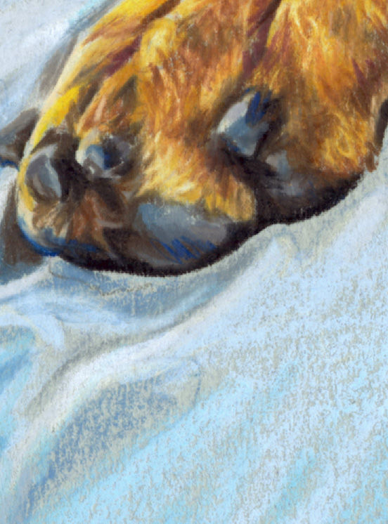
In this pic you can really see the difference between the tightly-detailed pencilwork of the paw, and the loose pencilwork of the fabric.
For the fabric I'm making use of the blue paper.
In Titan’s rust areas I’m covering the blue paper.

For Titan’s paw I completely cover the tooth of the paper. In the fabric I make use of the tooth: those tiny “hills and valleys” of the paper texture that show through the pencil pigment (see closeup in next pic). In his paw I don’t want any of those little blue paper bits showing. The paw is mostly “orange”. This shade of blue is the opposite of orange. Tiny spots of blue in the orange tend to make “mud”. (Blue + orange = brownish-grey) So on the paws I apply pigment heavily to completely cover the blue paper color. In the fabric most of what you see is paper color. I’ve used the paper color to do a lot of the “heavy lifting” of creating the fabric’s color.
That’s one of the main reasons I chose to do this portrait on the “Sky Grey” paper color. The other reason was because it really makes Titan pop.
FOR COLOR NERDS:
Titan’s rust markings pop on this paper color because orange is the opposite of blue. On a color wheel, orange is opposite blueish-green. That’s called a “complementary color”. Any color tends to “pop” against a background of it’s complementary color. Or when surrounded by it’s complementary color. That is true of all the “orange” tones in Titan’s rust markings (rust browns, reddish browns, muted orange, orangey-yellows). The black areas of Titan’s coat (not visible in this pic) “pop” on this paper because they are so much darker than the light blue paper. I chose this particular paper color because of the fabric, and because of Titan. The only two things in this artwork.
2
In this extreme close-up you can see the paper tooth: the little valleys in the paper texture. The little valleys show through in the fabric where I’ve applied pencil pigment to the “tops of the mountains”. In the paw I’ve applied hard pressure to push the pencil pigment down into those valleys so no blue paper shows through.
Titan portrait in progress 9
Completing Titan’s paws…
Drawing a hand or paw is as complex and detailed as the features of a face, in my opinion.
Upper pic - Going around the edges, building all the edge colors, before filling in all those weird abstract shapes that make up the paw and wrist.

FOR ARTISTS:
I fill those containing edge colors of the paw first, so I can establish the values (lightness-darkness) of the paw colors against that blue-grey paper. Then work inward, filling in the abstract shapes of the paw (the fingers, hand, and wrist) by connecting them to the colors and values of those edge shapes. I did that same thing when I completed the paw on the left.
Working on a mid-value paper like this “Sky Grey”, means establishing values in relationship to the value of the paper. This paper is what I would call a medium value or “mid-tone” — not a very light value paper color, but on the lighter side of medium-value. The colors in Titan’s paws are both darker and lighter in value than the paper. Putting in the edges of the paw first helps me establish all the colors and values in the “interior” of the paw shape. Note that the values on the top of the paw (Pic 1) are lighter than the paper color, and the values at the bottom of the paw are significantly darker.
That would be very different if I was working on a white paper (ALL the values would be darker than the paper), or for example a dark green paper (all the values would be lighter than the paper except the darkest browns and black, and the colors would be opposite green on the color wheel).
Titan portrait in progress 10
After I finished Titan’s paws, I drew the toy. The well-loved tug toy.
Then I finished the shadows under the toy and paws on the fabric. Whenever a figure is resting on a surface in art, there will always be a shadow that "connects" them to the surface. Otherwise it will look like they are "pasted on" the surface, or sometimes floating above it.

I could have cleaned up the toy, but I thought it would be better to show that it was well-loved....yet another indication of the partnership Titan had with Alicia. A dog can’t play with a tug toy by himself.

Titan portrait in progress 11
Even when a portrait is “finished” there are changes to be made.
An artist may think a portrait is finished when they complete the depiction….but is it?
When I finished Titan’s portrait I stood back and looked at it taped up on the wall from several feet away. That’s always the last step when I complete a portrait. Sometimes I see things that need a little adjustment. Usually that’s just a few additonal pencil strokes…a few minutes work. But this time I spent a couple more days on it.
After that, there’s an important decision only the client can make.
1
When I stood back a little distance, the tug-toy looked pale and washed out. It didn’t have the obvious bands of light brown and white like in the reference photo. So I darkened up all of the brown bands on the toy. The darkened version is on the right. I also made the red edging more prominent, especially at the top edge where the edge of the toy disappeared into the pale blue of the fabric.
On a phone screen it may be hard to see the difference. Zoom in to see it on a small screen.

2
I also didn’t like the balance of lights and darks in the fabric. So I darkened up the fabric where it falls toward the bottom (below Titan’s paws). You may remember I did the fabric with fast, loose, sweeping pencil strokes. Not tightly rendered detail. So I went back to that “scribbling“ style to add more dark grey-blue pencil work.
The result is on the right. Darker values in the lower left fabric balance Titan’s dark figure better. There was too much light space all around the central figure, like he was floating in a pale bubble. Darkening more toward the bottom edge of the artwork grounded the figure more in the scene.

I could have darkened the lower fabric in the lower right a bit more also. But I really liked the artistic quality of the scribbles there, and didn’t want to scribble over them. 😉
3
This is how the full sheet of paper looks now.
But wait, there are more changes yet to be made.

Notice I haven’t signed it yet…..
My next step is to kick the ball back to the client for an important decision. I can’t add my signature until after the decision is made.
Titan portrait in progress 12
Before I could finalize Titan's portrait, there was another decision the client had to make.
Alicia had ordered a 16 x 20 portrait. I always work on a full sheet of Canson paper, which is 20 x 26 inches, and trim it down at the end. I marked out the edges of the 16 x 20 when I drew the initial line drawing on a sheet of “Sky Grey” Canson paper. Then I ended up working out to the edges of the paper with the folds of fabric. I knew I was going well outside the 16 x 20 size, but I wanted to make long sweeping pencil strokes for the fabric folds, and it’s easier to do those out into empty space than to stop at specific crop lines. I told Alicia that when the portrait was finished I’d give her the option to keep the entire sheet of paper (at no extra charge)….or have me trim it down.
When the artwork was finished we had reached that decision point. Alicia could keep the full sheet, which is the entire image you see here (largest black rectangle). I gave the option of 3 smaller crops, the smaller rectangles. You can’t picture each crop from looking at this image, so I sent a separate jpg of each of the 4 crops so she could see what they would look like. The smallest rectangle is the 16 x 20.

I haven’t added my signature yet - my final step - because the placement of the signature depends on where the artwork will be trimmed.
Alicia chose to go with the original 16 x 20 . And I agree, it’s the best composition for a portrait of Titan. But a bit sad to trim off the pencilwork of the fabric and discard it. Here's the 16 x 20 crop:

Titan portrait in progress 13
Here’s a problem that crops up with every single portrait.
When I have finished a portrait to the best of my ability, I send a high-resolution jpg of it to the client so they can zoom in and check details. I ask if there is anything that needs to be adjusted. Sometimes a client requests a small change like darkening under the chin or remove a spot that I thought was part of the dog’s coat but was a piece of dirt in the photo. The client is usually right-on, the changes improve the piece.
Alicia kept saying she wanted me to darken it. She asked me to darken Titan’s rust areas, and I did. Then she asked me to darken his black coat. (The highlights on the coat.) Normally I would make the client’s changes without question. But I really did question this. To me the artwork looked just right. This is the problem:
My client and I were looking at the same jpg on two different computer monitors.
I carefully adjust the jpg of the portrait to be as accurate to the artwork as possible, holding the actual artwork beside my monitor. That’s done on my office computer, a high-end display color-balanced with a spectrometer. As I was struggling to understand what looked too light to Alicia, I opened the jpg on my studio computer. No wonder she thought it looked light. It was….on a different monitor.
When I adjust the colors to match the artwork on my office computer, on my studio computer it looks too light. If I adjust the colors to match the artwork on my studio computer, on my office computer it looks too dark, and too red. Every monitor displays color differently. That’s an ongoing challenge when sharing artwork with clients.
Here are the two jpgs side-by-side so you can see the difference. I have no idea how the colors will look to you.

Adjusting the color on my studio computer with the actual artwork in front of it. On the monitor is the scan (on the left) that I had adjusted on my office computer. A duplicate of the scan is on the right, and I’m just starting to adjust it in the studio to match the artwork.

Titan portrait finished
Titan's portrait is finished. Here’s what Alicia told me about this amazing, one-of-a-kind Doberman:
“A funny story I like to tell and is remembered by many is Titan’s first container search at a scentwork trial at Durham Kennel Club. When he walked into the building for the first time and stepped into the ring, he completely ignored the two neat rows of white boxes and made a beeline for the wall of mirrors. After tilting his head this way and that, he began admiring the incredibly handsome dog staring back at him and pacing back and forth to make sure every angle looked good. The admiration ended only when the spectators started to snicker and laughter. He rushed over to his new fan club to strut his stuff. The search itself never stood a chance between him checking himself out and his adoring fans.
That was the theme for the majority of his scentwork career. He’d strut out of a search area looking so proud of himself, and I’d be grinning or laughing so hard that people assumed we’d absolutely crushed it. They’d congratulate us on our “amazing search,”. I would just laugh with a thumbs down leaving them wondering how an NQ [non qualification] could be funny.”

Alicia had always described Titan as
“cheerful, goofy, and just a bit mischievous".
Then she told me this incredible story about the reference photo this portrait is based on:
“The photo was taken in May 2024, at a Comfort Inn in Blacksburg, VA the night before an AKC Scentwork trial, the last for the season. I was hanging out on the bed playing with his tug, enjoying himself as you can see by the look on his face. The next day we were at a camp doing a master interior search when he got shocked by a wall outlet with a broken cover, he screamed and it dropped him to the ground and he didn’t move for what felt like a long time when he finally crawled to me. It was in the 3rd and final room of a Master level search which would have been his title. He was really shaken but rallied for me and we were able to do some exterior searches and buried that weekend and he was his happy self as long as we were not going into any buildings other than the hotel. It took several months of hard work to get him to not have an aversion to going into unfamiliar rooms as a result of the shock, during which time we also started the immune suppression to resolve the immunity issue he developed. He had a lot of health challenges with the treatment and we thought we were on our way back. The week before he died he earned his Master exterior title which left him only 1 leg short of earning his overall Masters Title, the leg we were missing was the last interior search we ever entered which was the day after that photo was taken.”
Portrait of Titan: the true heart of a Doberman.
(Goldgrove Irish War Cry CAX FCAT SWNE SWE SCM SEM SBM SHDN WAC RATN CGC TKN ATT NW1)
❤️ Commissioned by Alicia McCarthy.
🎨 Prismacolor pencil on “Sky Grey” Canson Mi-Teintes paper, 16 x 20 inches.
"Titan" is a FULL BODY portrait, one of my 5 portrait types.
You can learn more about my 5 portrait types HERE.


Comments