
Annie portrait in progress - start to finish
- Kevin Roeckl
- 12 hours ago
- 7 min read

October 1
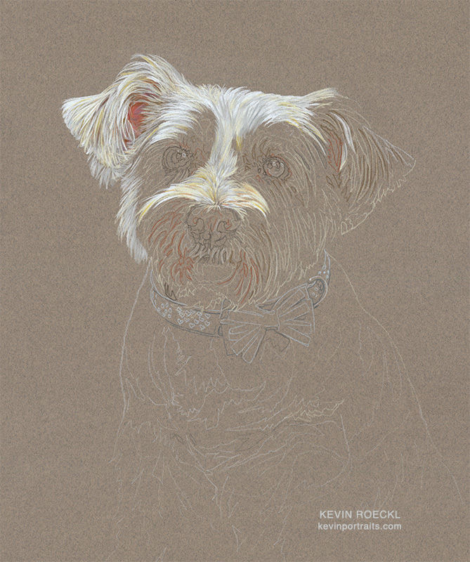
I'm starting on a portrait of "Annie" for Carolyn, Gloria, and Tammy. This is the 10th portrait I have done for them over the past 28 years.
The pencil colors for her white and cream-colored coat, and the pink inside her ears:

Once again I'm letting my paper color do the work.
A white coat is so easy to do on grey paper. Some light-colored pencil strokes for the hairs.…and the shadows between the hairs make themselves.

🎨 Prismacolor pencil on “Felt Grey” Canson Mi-Teintes paper. 18 x 23 inches.
Commissioned by Carolyn Martini, Gloria Kehoe, and Tammy Cunningham.
Annie portrait in progress 2
Yesterday I shared Annie’s left ear finished and pointed out that a white coat is easy to do on grey paper. Some light-colored pencil strokes for the hairs.…and the shadows between the hairs make themselves.
I continue using the paper color...
Carolyn responded to this in-progress picture:
“Look at my pretty princess!!! She’s looking pretty!!!”
2
Check out how much grey paper is showing around Annie's eye.

I never get tired of doing eyes. Because the colors and reflections in them are so interesting. Even though eyes are very nerve-racking…because they are so important in a portrait.
Annie portrait in progress 3
Both of Annie’s eyes are finished.

What do you see in this eye?
This is the right eye in the client’s reference photo — extracted from the rest of the photo so you can focus on just seeing what is there.
Focus on the colors, the shapes, and the values (value = lightness/darkness). All those unusual shapes on the eye are the reflections of what was in the environment around the dog. Often I can make out the windows and furniture of the room the dog was in, and sometimes a shape that is the person photographing the dog….distorted by the curve of the eyeball.

Reflections on the surface of an eye are what make the eye look shiny.
Below is a close-up of the right eye in the portrait.
To do reflections in an eye, just draw what you see. What is actually there in the photo, not what you think is there.
An eyeball will always have a highlight, usually bright white. That’s one of the things that makes an eye look “alive”. I try to make that highlight the brightest white I can get with colored pencils on colored paper, occasionally I’ll touch it with some opaque white paint to really bump up the whiteness. Sometimes it is the only true white in the whole portrait. The highlight being the only thing in the portrait that’s actually white, is one of the things that makes the eyes “pop”, that makes the eyes look so striking, in my portraits.

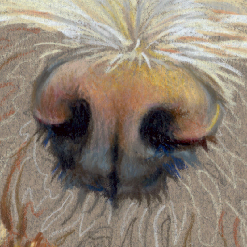
Annie portrait in progress 4
Quite an interesting mix of colors in Annie's nose. Light yellow ocher, dark yellow ocher, cool mauve, warm mauve, grayish pink, orange, rust, chestnut, warm greys, cool greys, chocolate brown, sepia brown. And of course black.
Most of the pencils on the left are the ones I’m using for Annie’s coat. They live on a piece of clean white paper that I move around where I need it (and an eraser that keeps them from rolling). I add another sheet of paper (and eraser) with a different collection of pencil colors when I’m working on another color-set in a portrait. The colors on the right are all the ones I’m using for Annie’s nose….plus some of the pencil colors on the left too.

A lot of different colors are going into depicting Annie’s nose.
The part of a dog’s nose referred to as the “nose leather”.

Light yellow ocher, dark yellow ocher, cool mauve, warm mauve, grayish pink, orange, rust, chestnut, warm greys, cool greys, chocolate brown, sepia brown. And of course black.
Annie portrait in progress 5
Annie’s cute face is finished. Next her turquoise “princess collar”.

Annie portrait in progress 6
In the original photo Annie was wearing a bandana, which the clients asked me to remove. I asked if they wanted a particular collar on her, or no collar. Carolyn requested that she be wearing "a princess collar because she is a princess”. I photographed my Sara’s “party collar” and sent the clients two rough Photoshop layouts, with suggestions of either pink or turquoise, which I felt were good colors to compliment Annie's coloring.

In the artwork I straightened out the bow ribbons a bit. And I didn’t notice when I took this pic that the heart pattern on the collar was upside-down! So I made the hearts right-side up in the artwork, and equally spaced apart. The pattern of hearts on this collar didn’t work well in the artwork at the tiny size created with very sharp pencils.
The clients chose turquoise for Annie’s “princess collar". In the original photo she was wearing a turquoise bandana, which they wanted me to remove. Turquoise is a good color for her.

I usually think patterned collars on dogs are going to go fast and easy.
I am usually wrong.
Adding the collar took a full studio-day.
These are the pencil colors I used.

Annie portrait in progress 7
Making a fade-out at the bottom of a head-study portrait can be tricky. Sometimes I use Photoshop on the client’s reference photo (or on my layout if I’m combining more than one photo) so I can see where to make the fade out. How far down the neck or body to start the fade so it makes a pleasing overall composition with the subject’s face as the most important feature. Sometimes I fade out the bottom very carefully, as though the realistic detail is becoming fainter and fainter toward the bottom until it disappears into the background color. Other times I make rough “scribbles” to fade the subject from highly realistic detail to “not realistic detail”, just the obvious use of the medium the artist is working with.
For Annie’s portrait I plan to fade down the realistic detail gradually.
1
First I completed the detailed texture of her coat “at full strength” - covering the paper with full pressure on my pencils just as I had throughout her head and collar - down to the point where I expected to begin the fade. Notice I’ve got a nice rounded curve to the bottom of her coat in this pic. From there I will fade that same curve downward an equal distance all along it’s curved bottom edge. About 2-3 inches in this case.

2
Working on the fade-out.
I faded Annie’s coat texture by using lighter and lighter pressure with my colored pencils as I went downward. But I also did it by choosing colors that were closer and closer to my background color. That would be the same regardless of what background paper color you are working on.

3
After I completed that fade, I taped the artwork up on my studio wall and stood back to look at it, as I always do when I finish a portrait. I saw that I had made the right foreleg come downward too strongly. In Pic 2 you can see that it stands out more. I did that because that leg is forward more toward the viewer. It made sense to me.
When I stood back to look at it, I saw that leg was too prominent. It pulled the eye downward like an arrow pointing at the bottom of the artwork. So with an eraser I smudged the bottom of that leg up a bit, lightening it, and with my pencils I lightly and carefully evened out the bottom of the fadeout until I was happy with it. An artist can only judge that when standing back at the distance a viewer might see the finished artwork hanging on a wall. At my worktable I am too close to see the whole composition.

Annie portrait finished
One of the great things about doing portraits is getting to know the wonderful dogs my clients love. Annie is one of those. I have done 10 portraits for these clients, Carolyn, Gloria, and Tammy. Each of the three women shared more with me about Annie, in individual emails, then they have with any of the other dogs that have graced their lives. Below the portrait is what they told me about Annie.

From Carolyn:
“Annie is a small Weston terrier mix of some sort. She was originally adopted by Gloria’s brother from a rescue. Her brother was living in our basement. She really never wanted to stay downstairs, she would always come to the top of the stairs and cry to be with Briscoe [our border collie] One day we were going away for a week to Maine and taking Briscoe. She wasn’t having it! She jumped in the car and wouldn’t get out! She was like you’re not leaving me behind! From that day on she became our dog!
Annie has a big personality for a little princess. She tells us exactly what she wants when she wants it! Very smart! Lots of personality for such a small girl!!!”
From Gloria:
“I sent you some pics of Annie. I wanted to show you all the personality she has. She is really a diva, and interestingly, Briscoe lets her have her way all the time. I think it's because when she was a puppy, Ollie [their last Doberman] and Annie had a great bond and Briscoe just learned from him that she was off limits 🙂”
Here's a photo of Annie and Briscoe.

Commissioned by Carolyn Martini, Gloria Kehoe, and Tammy Cunningham.
But wait, there's more!
After the portrait was finished the clients asked me to create a custom Christmas card from Annie's portrait by combining it with the portrait of Briscoe (Border collie) that I did for them last year. I combined them and customized it in Photoshop by changing Annie's "princess collar" to holiday colors, and added the Santa hat on Briscoe. It made a fun Holiday card!

"Briscoe" was the 9th, and "Annie" is the 10th portrait I have done for these clients over the past 28 years.
Both portraits were created with Prismacolor pencils on “Felt Grey” Canson Mi-Teintes paper.
18 x 23 inches.
"Annie" is a HEAD STUDY portrait, one of my 5 portrait types.
You can learn more about my Portrait Types HERE.


Comments