
"Three Cats on Stairs" portrait in progress 9 - Custom-designed fabric

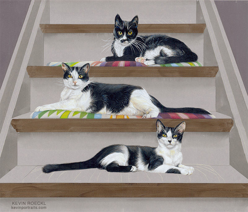
I've finished the stair cushions under the cats. They were custom-designed using photos of Tammy’s bedspread to see the colors in her decor, and the fabric pattern as inspiration. These captions give a detailed description of my thought process and what I did to make the colors and pattern work with the composition of three black-and-white cats and a staircase.
1
I’m using Tammy’s bedspread as reference for the colors she wanted. Mauves and purples are the main colors in her decor.

There is no reference photo that shows this fabric pattern on the stair cushions under the cats….
2
So I had to invent where to put the colors and patterns. That took a number of decisions, because those colors and patterns had to enhance the cats, not take away from them. It had to showcase their white or black areas by putting a light color next to the black, dark colors next to the white, not lose their edges against colors of a similar value. The shapes of the fabric pattern has to point your eye to the cats, not away from them and off the edges of the canvas, or to the cushions instead of the cats.
And the pattern of each step has to make a harmonious composition with the pattern and colors of the other steps….not just copy each pattern the same on every step. Because the pattern of black and white on each cat is different, so the shapes and values adjoining each cat on each cushion had to be different. (Plus it would look boring and repetitive if the fabric pattern on every step is the same.)
I wanted the colors of the cushions — the purples and pinks, the greens and light blue, the oranges - to form a pleasing composition overall — not having all the purples on the left on every step, all the greens on the right on every step, and so on.

3
To do that I created the first cushion, under Grace, the upper cat. I kept the values light at the left end of the cushion light so Bonnie’s (the middle cat’s) ears and head would stand out. The pattern of pink, raspberry and purple under Grace’s white bib point your eye up to her face. And those are the prominent colors of Tammy’s decor.

4
Then I taped the artwork on the wall and stood back from it, in a spot where I could also see the bedspread reference photos on the monitor, and judged what color pattern would look harmonious with both Bonnie (the middle cat) AND the color pattern I had already created on Grace’s cushion.
I didn’t want any light values (the white parts of the fabric) adjoining Bonnie’s white front leg, or rear foot.
My workspace with reference photos on the monitor. This is what I see as I am looking at the artwork taped up on the wall (outside the photo to the left), while standing where I can also see the bedspread photos at the same time, thinking about what shapes and colors I need to create next.

5
After I finished the middle step, the decisions came closer together. When I taped the artwork up on the wall and stood back, for the bottom step I could judge only a small group of colors and pattern at a time. For example deciding to put blues and greens in the center under Morgan (the bottom cat), to balance the blues and greens on the other two cushions. (On the left under Bonnie and right under Grace.)
After I added those blues and greens, I had to again tape up the art and stand back to figure out what colors and pattern to put on the left end of Morgan’s cushion. I chose raspberry purples to balance where those colors were on the other two cushions. Then the same process deciding on the color under her front paws. I wanted to be careful with oranges in this artwork. I did not want a lot of that color, to take away from the cats’ yellow eyes, and because orange is not a color in Tammy’s decor.
Then more decision-making to figure out what color and pattern to finish the right end of the bottom cushion. Light colors to make the cushion light against the grey background? Dark colors to delineate the cushion’s shape? I chose the dark colors for that reason and to showcase Morgan’s white paws. And to balance the purples at the other end of the cushion. I was pleased with that bottom cushion, which is larger and shows more color and pattern visible than the other two.

6
Finally, when those 3 cushions under the cats were finished, I made the cushion on the topmost step. That required even more standing back and looking, making decisions about every few stripes of color. That upper step is not featured in the subject matter: three cats. It had to have a cushion that matches the other 3, and to showcase Grace’s head and ears. But not draw attention to itself. So the color placement was important. I kept the colors muted, more muted than the other cushions. If I did that right, you wouldn’t notice. They have to look like “the same” colors. But they are just a little more muted so they don’t jump out.

7
Another thing that took some concentration while creating the color patterns is that each step is smaller than the one below it, so the stripey pattern of the fabric had to be smaller on each one. Each cushion has approximately 22 stripes. I eyeballed the size/width of the stripes on the first two cushions, the middle steps. For the bottom step I eyeballed the size of the first group of stripes (the greens and blues), but then had to double-check stripe width on a few of the others by measuring them. By the time I got to the top cushion I had to count and measure out 22 stripe widths with a ruler and make tick-marks to keep me in the correct size range.

The staircase was made with watercolor underpainting to give the basic forms. Stair details will be added over that with colored pencil next. The cats and cushions were done entirely with colored pencil on the grey paper. This grey is a nice neutral base color that takes all colors of pencil very well.
“Three Cats on Stairs”
Commissioned by Tammy Cunningham.
🎨 Prismacolor pencil and watercolor on “Flannel Grey” Canson Mi-Teintes paper. 20 x 26 inches.


Comments