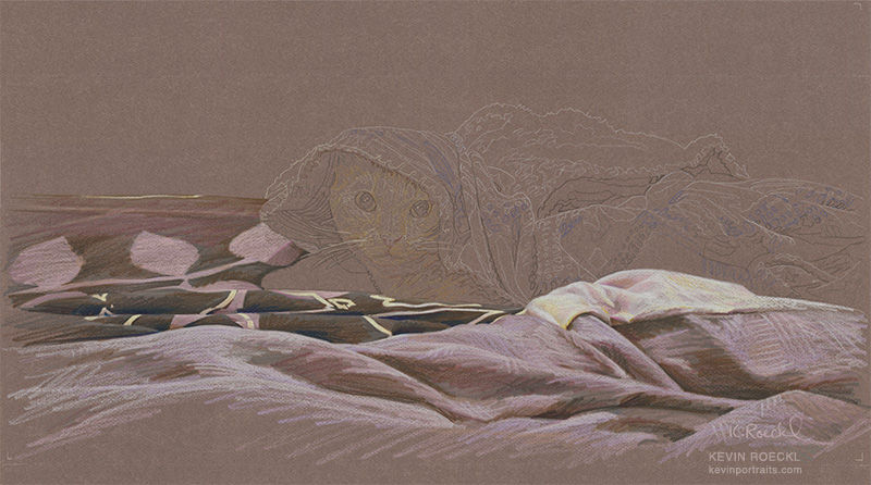
Tanner portrait in progress 2
- Kevin Roeckl
- Jun 4, 2021
- 2 min read
My concept for Tanner’s portrait is to do the bedding in big, loose, gestural strokes, and Tanner’s face in tight detail. I chose this particular color of Canson paper because it’s the same color as Tammie’s bedding - a muted mauve. So it’s just a matter of adding the lights and darks of the folds, not changing the basic color at all. Tanner’s orange face will "pop" because it’s quite a different color.
The bedding is finished, and you can now see what I meant to do. The hills and valleys of the blanket in the foreground are just loose scribbles of strokes on the mauve paper to give it form.

A close-up so you can see the “big, gestural” pencil strokes. To get colored pencils to make a quarter-inch wide stroke like that, I scrub them back and forth on a scrap of rough paper to flatten the end.

The key to these big impressionistic strokes is to work fast. Not stopping to carefully edge around sharp details, but very quickly dashing the shapes and colors into their general area. When standing back from the artwork, if it was done right, the folds and shadows look photo-realistic. Up close, you can see how loosely those strokes were thrown onto the paper. There is a lot of energy in them as I move across the paper…using just 5 or 6 different colors in that mauve-grey color range.

Here's the scrap of rough paper I was using to flatten the pencil points. This is what it looked like after today’s work.

A wide flattened pencil next to a sharp pencil point. That's how I get those big wide strokes out of a pencil lead.


Comments