
Scout portrait in progress 14 - How to make straw
- Kevin Roeckl
- Oct 16, 2025
- 7 min read

Updated: Nov 6, 2025
This album shows my technique for making straw in a scene. A whole lot of it.
1
In my last post, I had finished the Frisbee scene, and put in a bit of the straw detail around Scout’s barn-hunt figure on the gold underpainting. It looked like this:

Next I have a whole lot of straw to fill in. If you read my post about barn hunt, you know that Scout is searching for rats hidden among straw. There will be a tunnel entrance below and in front of his face. That’s where you see the darker brown splashes of watercolor in the bottom center of the composition. That was done way back at the beginning with my gold/brown underpainting.
2
I’ve been working on a tutorial for how to make grass, I have a technique which can create large areas of grassy lawn pretty quickly. Straw is done basically the same way. Except using a different set of colors (golds/browns instead of greens). And like with grass, the key is working on the right background color. That's why I did an underpainting of yellow-ochre across the lower part of Scout’s portrait, on the grey paper.

When I took this pic I had added a few highlighted straws, by projecting the barn hunt scene and tracing just the brightest straws with cream pencil.
3
That’s to give me some guidance about the size and randomness of the straw, and the size of the straws in the foreground (larger) vs the ones behind Scout (smaller, further away).
This is exactly how I start my grass technique. Cream pencil strokes for the brightest grass blades. But on green paper, instead of gold. And the grass blades are more upright….they don’t go in as many different directions as straw.

While I had my projected image on the paper, I also threw in a few of the darkest shadows between the straw with chocolate brown and rust pencils. You can see those throughout the right and bottom areas in this pic (above). Notice how crudely I’ve jotted those in. The straw does not have to be precise like Scout’s coat and features.
4
These are the pencil colors I’m using for the straw. I don’t need mid-value yellow ochre, because the underpainting gives me that. If you follow my work you know I use paper color to save myself a lot of work. I have light colors for the highlighted straw strokes, and darker colors for the shadows between straws.
My light colors are cream, beige, and pale yellow-ochre. Dark muted orange, dark yellow ochre, greyish mauve, and a variety of medium-value browns and rust pencils — for the darker spaces between straws.

5
I start by making the straws that are touching Scout’s figure: around his legs and head in this pic. I have to go pretty carefully there because I don’t want to be doing fast, scribbled strokes and have them accidentally overlap the precise edges of his finished fur.

Also I make certain that wherever a straw shape meets the edge of Scout’s figure, it’s either lighter or darker than that edge, so Scout stands out crisply and cleanly from the straw. More crisply and cleanly than in the photo. (See next pic.)
At this point I’ve pretty much finished the straw that is directly adjoining Scout. Now I'll just keep working outward from there, adding onto the finished straw in sections, finishing each section before adding the next. The farther I get out from the edges of Scout, the more fast and loosely I work. I’ll say it again, the straw doesn’t have to be done with photographic precision, to look like straw.
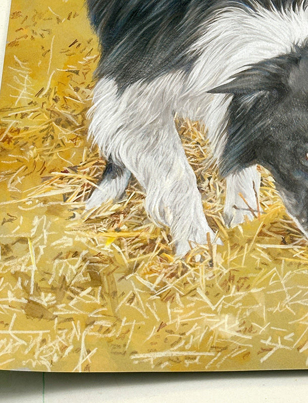
Once I’m clear of the figure’s edges, I can throw down fast, random strokes to make the straw texture, with quick slashes of colored pencil.
7
The technique I use, which is the same as my technique for doing grass….is to start with cream-colored highlighted straws or grass blades. In this before-and-after pic below you see how that looks.:
In the before pic my cream highlight straws. Then I progress through my pencils from lightest to darkest. With my light colors - the ones lighter than my gold underpainting - I add additional straws. Slashes of beige and very pale grey-brown. Not as light in value as the highlighted cream straws, but lighter than the background color.
As I work my way through my mid-value colors (yellow ochre, orange, mauve) I put some of them exactly over the bright cream straws. That creates a color that’s a blend of the two. So all my highlight straws are not just the same cream color. Some are light-value orange, yellow, and a buff/mauve color.
Finally I come to my darker-value colors: dark mauve, rust, light umber (greyish brown), and chocolate brown. Now I add those IN BETWEEN the lighter slashes I’ve made for the straws. These become the spaces between the straws. Some of those “shadow-spaces” shapes, I trace precisely against the bright edges of straws. Others I just throw down jots of pencil randomly but more or less in the spaces between straws.
The result looks like this. On the left is the gold underpainting with cream highlight straws. And a few jots of shadows-between-straws.
On the right is the completed straw, after I have worked through my pencils from lightest (slashes of straws) to darkest (spaces between straws). The darker the pencil, the fewer the jots and dashes I make. I don’t want to end up with a bunch of chocolate-brown straw.

8
Here’s what the pencilwork actually looks like.
Toward the bottom you see how loose my strokes are. This was easy to do because of my yellow-ochre underpainting. That underpainting has saved me a WHOLE LOT of coloring-in every single speck of grey paper with yellow-ochre and brown pencils.

9
Here’s another section showing the before and after progression. The top pic shows my highlight straws done with cream pencil on the gold background. In the bottom pic you can see where I exaggerated the cream highlight straws, added other light straws, and put in the jots of darkness between them with a variety of orange, rust, and brown colors.

As I mentioned, I “build out” the straw in sections. The previous sections around Scout’s legs and the entire bottom left corner of the artwork were finished. This was the next section I added onto those. This takes me to the top edge of the tunnel. My next section will be the light straw next to Scout's forehead. Lastly the darker interior of the tunnel. I’ll do that the same way, but with more of the darker pencil colors.
10
The pencilwork below Scout’s nose. It’s very scribbley.

11
I also added the section behind Scout on the far left. That is a much darker section where the side of a straw bale is in shadow. I did have to use a lot of brown pencil here. I made the straws the same way with my lighter colors, but with a higher proportion of the darker-value colors. Then rubbed over all of that straw-texture lightly with Light Umber (mid-value grayish brown) pencil to darken it even more.

I also highlighted the top of that bale. Just some slashes of cream and beige to make highlighted straws on that useful yellow-ochre underpainting.
12
I’ve finished another “section” of straw — this one to the right of Scout’s head - to build out the straw across the artwork going toward the right. This is as far to the right as I’m going to go with straw detail.
Why?

--- Filling the entire bottom of the artwork with straw detail would make it unbearably "busy". The busy texture of the grass and the busy texture of the straw… it would just be too much.
--- The shape of the straw bales and the tunnel make enough of the barn hunt scene around Scout to tell the story. That's all that is needed. I don't need to fill the whole bottom right corner with straw. The subtle variations in the underpainting are enough to keep it from being too flat and boring, and the color tells the viewer that straw continues.
--- I don't want anything in that lower right space that would pull attention away from Scout’s figures.
13
This is how I’ve faded out the straw. You can really see how my gold underpainting does so much of the work.

I sent pics to Annette and wrote:
“Here’s the latest. Tomorrow the tunnel entrance. You can see where I’ve put the highlighted straw hanging over the top of the tunnel.”
Annette replied:
“Beautiful!! Yes - I see the beginning of the tunnel edge. What an unexpected detail to further enhance the hunt setting!! I never imagined straw could be so involved!”
14
Lastly, I add the tunnel. I had most of my darker values there already, since I had planned that darker tunnel entrance into the composition, and when I did the underpainting I splashed some brown watercolor into the wet yellow-ochre wash to create some random darker shapes. You saw that in the previous pics.
I knew that (being a wash, not a strong opaque color) that brown would be lighter than my strong brown pencil colors. I wanted to be guided by that lighter brown underpainting as my correct “dark” value. I very emphatically do not want a very dark shape at the very bottom edge of the composition, taking attention away from the black Scout figures. Because black figures are so strong visually, I don’t want any values that are even close to that degree of darkness, to compete with the impact of black-and-white Scout.

So I carefully controlled myself when I added these dark brown “shadow shapes” between the straws inside the tunnel with pencil. I allowed myself only a few, and did not let myself overwork it. There are a few dark sepia brown and chocolate brown shadow-shapes just under the top edge of the tunnel where the bright straw overhangs it….and a few dark shadow shapes at the very bottom of the artwork. I could almost count those bottom dark shapes on one hand. I limited myself very strictly. Note how those dark shapes “lean” toward Scout’s face. Almost like they are pointing at him. Putting such a dark hole that low in the composition was something I did carefully. It’s entire existence had to be about Scout.
15
I have only one thing left to do now. Finish the neck and shoulders of Scout’s head study. I’ll fade it down into the two action scenes to tie all 3 figures together.

Then I'll stand back and judge what finishing touches or adjustments need to be made to the whole portrait. I’ll show you in my next post how I do that.
Triple portrait of “Scout”
Commissioned by Annette Riehle.
🎨 Prismacolor pencil and acrylic wash on “Flannel Grey” Canson Mi-Teintes paper
20 x 26 inches.
From reference photos by Faith Lyman, Jackie Singer, and Donna Childs.


Comments