
Scout portrait in progress 13 - A decision to make
- Kevin Roeckl
- Oct 4, 2025
- 5 min read

Updated: Nov 6, 2025
The two action figures in Scout’s triple portrait are finished, and now I have a decision to make: Should I finish the grass around the Frisbee figure first, or the straw around the barn hunt figure? Pic 1 explains why that decision was important, and the rest of the pics show how I resolved it.
1
At this point the backgrounds are just flat color, no detail. You may remember I masked off the two action figures so I could do Scout’s black-and-white coat with colored pencils on virgin grey paper, and made the green and gold underpainting around them. Now I’ll be working with colored pencils on top of the underpainting, creating the two scenes: a grassy hill and straw bales with a tunnel entrance.
I need to decide whether to keep “building out” the straw from the edges of the barn hunt figure where I added some around Scout’s legs….or finish the grass around the running Frisbee figure first.

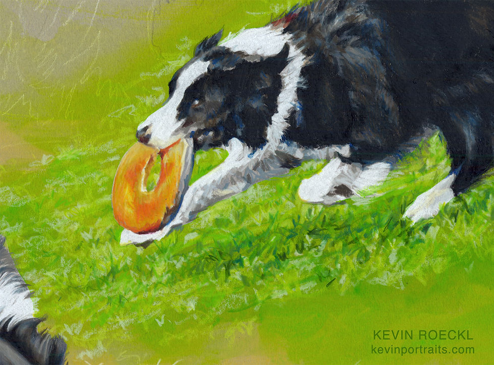
I have decided to do the grass next, and complete the Frisbee scene. I created that Frisbee figure in a “fast ’n loose” style with quick, impressionistic strokes, including some diagonal lines coming off the back of Scout to give a feeling of speed. I plan to continue diagonal lines in the grass - the shadows under the figure and the streaks of grass texture - as though he’s running downhill - in that same loose, impressionistic style. Those diagonal stripes will touch the shoulder of the barn-hunt figure. Bold diagonal lines give a dynamic feeling to a composition, a feeling of tension and excitement. But diagonal lines are not something to add lightly to a composition: they are strong features.
Since those diagonal stripes in the grass scene are important to the overall look of the portrait, I want to complete that next, so I’ll be able to judge as I’m working on the straw, how the straw scene works with the bold diagonal lines, the lights and darks and grass texture of the Frisbee scene.
Like many colored pencil artists, I tend to work on small areas at a time. But it’s important to also look at the overall effect as you work and consider the artwork as a whole.
2
Before I started on the grass I wanted to indicate some of the straw around the barn-hunt pose. So I could visualize how the two areas would meet up.
You may know that I project my figures to make outline drawings on the Canson paper at the beginning. I leave my projector set up in that exact position until I finish a piece, in case I need to project again. (It’s very hard to get the image precisely the same once it’s moved.) I expected I might do that with the straw. I fired up my projector and used cream pencil to put in a few highlighted straws with cream pencil, as you see here. The straws are larger at the bottom of the artwork (closer to the viewer) than they are behind Scout’s body (further away). These bright straw lines give me some guidance on the size my straw strokes will need to be. And enough of a visual to help me see how the green grass will look where it runs into the straw.

3
I created the Frisbee figure in a looser, more impressionistic style. So I create the grass in a similar style. I also wanted to exaggerate the diagonal lines. I made more streaks of grey and black coming out of Scout’s hind leg and tail, and matched the angle with streaks of green in the grass. That gives a sense of “tension”, or excitement, and also the sense of how fast Scout is running; a sense of motion. This shows the grass while in progress, haven’t yet finished the lower part where it meets the straw.
I wanted some fast music for this day’s work. Usually it would take me more than one day to complete a large grass area, working in a painstaking detailed style. I wanted to complete this in a single session, keeping the momentum of fast and loose and very energetic. For the soundtrack I returned to Jesse Cook - the music I listened to while doing Scout’s running figure - fast Spanish guitar with clapping and high-energy guitar riffs. I loved the energy and rhythm of it for this passage - I wanted to move as fast and energetically as Scout running, to capture his speed and athleticism. I actually worked up a bit of a sweat doing this!

4
This closeup detail shows how fast and loose the pencil strokes are.
It’s important not to overwork this impressionistic style. I could not have done this without having the green underpainting to tint the grey paper. (Or work on green paper). This loose, “scribbley” style lets a lot of the underlying paper color show through.
5
This close-up really shows how quick and loose my strokes were, on Scout and the Frisbee, as well as the grass.

I call that my “Little Jewel” style because it usually contains jots of bright, jewel-like colors, like blue on the edge of Scout’s black fur, bright red on the bottom of the Frisbee, emerald green in the grass. I offer a "Little Jewel" portrait type, my most affordable portrait category.
6
The Frisbee scene finished. Where the edges of the grass meet the gold underpainting, the green underpainting did a lot of the work of the fade-out. I just threw down some very fast “grass-blade” scribbles that escaped the edges of the green area to tie it to the barn-hunt straw. It's really important not to overwork that. I want the pencilwork in this loose style - especially for this energetic action scene - to look spontaneous.

I rarely work standing up, but I did the Frisbee grass standing so I could put a lot of physical movement into it. It may be surprising how much of their whole body an artist can put into their work - even with colored pencil.
I also wanted to stand because I needed to see the entire artwork to judge how this large grassy area was working in the overall composition, and how to fade out it’s edges in context with the other figures. I get a better view standing up looking over the whole artwork than when I’m sitting down and bending forward to work on it.
7
I went ahead and signed it too, while I was in that high-energy, fast-n-loose mode. I like to sign my work when I’ve been working and my hand is “loose”. Otherwise my signature looks “stilted". (Probably nobody would notice that but me.)

FOR ARTISTS:
When I’m going to be signing over a busy, detailed area (straw, grass, foliage, etc) I sign first, and then work the details in around my signature. Otherwise, if I’ve put down a heavy amount of colored pencil for the details, it “repels” the pencil I try to sign over it. With Prismacolors, a wax-based pencil, you can only build up so many layers. I plan ahead for where my signature will be.
Annette wrote:
“The portrait continues to be perfect - every decision you make and the resulting detail have been absolutely "spot on" in bringing Scout's "being" to life. I hope you are taking great satisfaction and finding much happiness in Scout's masterpiece!”
Triple portrait of “Scout”
Commissioned by Annette Riehle.
🎨 Prismacolor pencil and acrylic wash on “Flannel Grey” Canson Mi-Teintes paper
20 x 26 inches.
From reference photos by Faith Lyman, Jackie Singer, and Donna Childs.


Comments