
Remmy portrait in progress - start to finish
- Kevin Roeckl
- Oct 6, 2022
- 29 min read

Updated: Oct 7, 2022
February 28
I've been working for more than a month on just the preparation stages of a very complex, and very special portrait. For Walter Da Ponte who lost his heart dog Remmy last year. A gift from Walt’s wife Frann, who also loved Remmy.
How can I convey all that Remmy was and how important this portrait is?
For several months I had been seeing Walt’s posts on Facebook about his beloved Remmy. I saw that this man’s heart was broken, and he missed his best friend terribly, week after week. Every few days, after Remmy’s passing, Walt posted (and still posts) pictures of Remmy with captions, like this:

" 5 months today, 22 weeks tomorrow. Make it a double celebration of Remmy's life and memory today. Miss you more every day my friend. A beautiful loving heart like yours only comes once in a lifetime to a human, I'm glad it was me. Noseys and hugs up up to the sky for you Bubba"
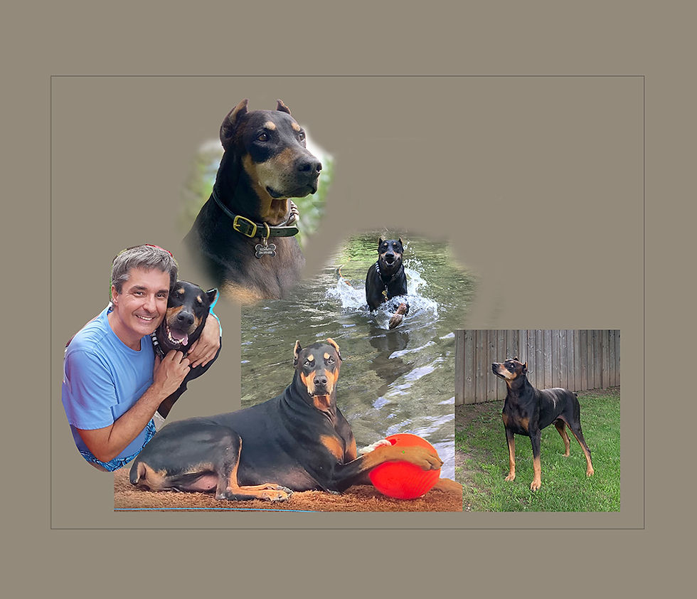
The first step in a memorial portrait is to gather the client’s photos. Walt is a talented photographer…and has tens of thousands of photos of Remmy! It took more than a month (and many tears) for Walt to go through them. It was a challenge choosing the best ones. He ended up sending more than 1,200, and many videos. It took me days to go through them all, and watch all the videos. But that really gave me a sense of who Remmy was - and who Walter is - and what they meant to eachother.

I began narrowing down the 1200+ pics Walt sent me by picking out the ones that would work best in a portrait and that best capture Remmy’s spirit, his essence and personality. This shows my choices, 102 photos, in my catalog app that helps me organize them. I can shift them around in a way that makes sense to me, moving my top picks to the first two rows, as I start formulating a game plan in my mind for a very complex layout.
Then, in a long phone call with Walt, each of us looking at those pics on our computers, I further refine the order. I color coded the pics to help me keep track mentally. Red labels are Remmy heads. Blue are favorite body shots. Magenta are the ones Walt loves the most, and which I think will work really well.
The pics that are greyed-out are the ones that in our phone conversation Walt and I agreed to cross off the list. The choices have to be narrowed down. My goal is to get down to about 12. Only 5 will fit in the portrait, or it will be too busy.
The one circled in white is a video that has some great views of Remmy that could be pulled out as still-shots. That’s Walt’s assignment. Only he knows the beloved expressions of Remmy that speak to his heart, I don’t.

Finally we have gotten it down to the working pieces. The pics in the top row are the ones dear to Walter’s heart, his absolute favorites of his boy. The first pic in the second row will be used for the river background (not Remmy). The others in the 2nd row are head shots, I can use one or two, not all.
Now I have my puzzle pieces and can start fitting them together. There is still a lot of decision making to go.

This is the same process I go through with every client. Remmy’s portrait is just “bigger” (more) than most. Larger-than-life, like Remmy was.
To help me narrow down the head choices, I bring in all the heads from our top photos: the head shots as well as the heads from the full-body shots, and put them in a Photoshop document. This helps me see how many have the same expression. The top row are serious, the lower rows are smiling. We don’t need two or three of the same expression in the portrait.
More than half of these have to be cut. Some of them are heads on a body, others will stand alone in the portrait as head studies.
There is a lot of mental work for me to visualize all of this in my “mind’s eye”…what will go where in relation to what else. Picturing the full bodies and the other colors in the scene too and how it could all possibly fit together.

Then I start building the layout out of pics Walt identified as the “must-have” top favorites with my guidance on what would work and what is redundant.
It’s like putting together a puzzle. A puzzle where you don’t know what the puzzle-picture looks like, and you don’t know if the pieces will fit, or if they might even belong to a different puzzle. And they can all be sized to different sizes - larger or smaller - and I can “flop” any of them them so they are facing the opposite way. In other words, there are many, many possible solutions to the puzzle…and most of them won’t work.

First I start bringing some of my photo choices into a Photoshop document, crudely cut out, on a grey background. Moving and resizing them into a pleasing, harmonious combination. There will be many moves, moving the pieces around and resizing them, before the final layout falls into shape. These are just the first few pieces.
The only thing we know for sure (it’s non-negotiable) is that the picture of Remmy splashing through the river has to be the centerpiece. Walt calls that his “Mona Lisa” of all the photos he’s ever taken of Remmy. His heart is full of the many, many fond memories of Remmy romping and playing in the river next to their home. That river was Remmy’s “happy place”.

The following are 6 of the 30+ versions of the layout I created. Walt (and sometimes Frann too) worked with me on what was pleasing to his eye, making some good suggestions…then I went back to work and sent him another version the next day. These are just a few of the many versions that kept evolving.
I’m still adding in the pieces at this point, and just moving them around, trying different combinations.
The pic of Walt and Remmy together (on the left) was too distracting, Frann said. The portrait is about Remmy, not Walt, and Walt’s face jumps out at you.
So I made the “Walt-with-Remmy” pic grey. In the portrait they would be a black-and-white sketch. A Photoshop composite can’t truly show what the original artwork will look like. It just gives a rough approximation so the client can get an idea how it will look.
And I’ve brought in the river-background photo. I needed to have that in place to see how the other Remmys would work on that background.

I’ve filled in the rest of the river scene crudely with Photoshop, so I could continue getting the right placement of all the other pics.

Finally Frann said the pic with Walter has to go. “She doesn’t love me!”, Walt joked.
The layout was finally starting to come together.
Walt really wanted that standing body pic that is in the lower right corner. But it looked out of place larger, it had to be small. And we were still trying different Remmy heads in the upper right.

I’d been working with a horizontal layout…

I tried a number of versions with a vertical layout too. I really liked this one, making the “Mona Lisa” Remmy larger and more important. But Walt really wanted his other favorite Remmy pics in it too. So back to a horizontal where they fit better.
We kept playing with it — me sending layouts to Walter and then getting his feedback - until, after 36 versions, we zeroed in on this. There is still lots of fine-tuning to do, but this is the layout we will go forward with. Quite an accomplishment to narrow down tens of thousands of photos to these 5. (Plus a river scene from a different shot). That particular combination of Remmys, in this particular configuration. This has been a very challenging layout-puzzle to solve.

This is a Photoshop composite.
Next I get in the studio and create the artwork.
Remmy portrait in progress 2
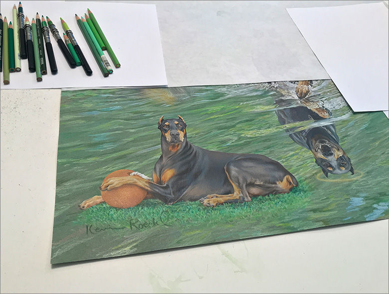
This portrait has 5 depictions of Remmy (two head studies and 3 full-body) on a river scene, with the center Remmy splashing joyfully through the water. For the river, I want green across the whole lower 2/3 of the painting. But not where the figures are.
The green color I want is muted, not bright. My paper is grey. So part of my strategy for how to construct the painting, is to do a green watercolor wash thinned a lot with water so it just tints the grey paper a little bit green. If I mix exactly the right shade of green watercolor, the river color will end up exactly right.
I’ll do it with a large watercolor brush sweeping across the paper from side to side. But I don’t want that green where the Remmy figures will be. “Doberman colors” work great with colored pencil on this beautiful grey Canson paper. If I tinted the paper green and then went with colored pencil over that, the Remmy figures would have a greenish cast to them. So I mask the figures off before I do the green wash.
I do that by cutting pieces of masking material, a translucent plastic film that is adhesive on one side. In this pic I’ve stuck pieces over the two lower Remmys. I cut around the outline of the left one with a very sharp x-acto knife, and lifted off the excess. The blade has to be extremely sharp — a brand new blade, never used — to cut through the masking film which is tough and takes a bit of pressure…but not cut into the paper beneath. It takes exactly the right touch.

I have cut out the masking material on both figures and the excess is balled up near the scissors. (Note in each pic I have the relevant Remmy on the monitor to check his outlines as I cut.)
I won’t mask off the upper two Remmys (head studies) because river-trees and rocks (done with colored pencil) will be behind those, not the grey-green water. I will fade the green wash below the upper-Remmys’ necks by swabbing plain water there as I work my green wash up to there, so it fades to totally transparent just below the upper Remmys’ chins.

Doing the watercolor wash. The layout I created in Photoshop is on the monitor to guide me. On that scrap of grey paper (near the monitor) I tested out how much to thin the green watercolor to get just the right shade of muted green on grey paper.
The masking film protects the two bottom figures, but I had to paint around the “Mona Lisa” Remmy (in the center) and the splashing water. The splash is too complex for me to cut masking film.

The wash is finished and painting materials cleaned up. Masking film is still on the two bottom figures.

The paint is thoroughly dry and masking film removed.

The paper buckled from being wet. Canson paper is not watercolor paper and is not made to take watercolor well. When the paper is not totally flat it’s hard for me to draw on it. So tonight I will wet the back of the the paper and press it under weights overnight to flatten it.
Remmy portrait in progress 3
The upper left head of Remmy is finished down to the collar. His shoulders and chest will fade out into the background scene. So I have to put in the background around his head next, so I know how to properly convey the fade-out of his body into the ripples of the river and the trees behind him.
There will be a surprise to the left of Remmy’s neck. Something that is very important to Walter. I’ll start working on that tomorrow.

When I sent the latest in-progress pics to Walt and Frann, they wrote this:
Walt:
Between tears all I can muster to say is BEAUTIFUL!!!!
Frann:
My goodness Kevin, these are incredible!!!
Remmy portrait in progress 4
In the background of this portrait is something you didn’t see in my layout, but is very important to have in the portrait...
Remmy’s Pig
After Remmy was rescued at age 8 he came to Walt and Frann with a rubber Pig.
He loved that Pig. When he felt stressed, he would get his Pig and carry it around with him.
If Ruby (their other Doberman) showed interest in his Pig, Remmy took the Pig outside and hid it.
That Pig was so important to him.
Frann relates this story:
“One time coming back from Florida, we stopped overnight and we left the Pig in the hotel room by accident. We had to move heaven and earth to get the stupid Pig back! The hotel couldn’t send it by FedEx to Canada for some reason, so the hotel FedEx’d it to a good friend of mine in Virginia, who had her assistant send it up to us. It cost us a hundred bucks to get that Pig back. I looked around for another one but couldn’t find one. That Pig was so…it was like your kid lost their baby blanket or something and life’s not worth living. When the Pig arrived, Remmy was so happy.”
From the time we began discussing the portrait, Walt wanted Remmy’s Pig included. Remmy’s Pig will be hidden in the bushes on a bank of the river scene. Just as he did in life.


Working in the studio. On the monitor, Pig is in my Photoshop layout that I created…that is an actual photo Walt took of Remmy’s pig hidden in some bushes. On the right are some reference photos Walt took for me. In the layout photo Pig looked too blue, so I was glad to have those other pics to show his true turquoise color.
My pencils in action. On the left are greens I’m using for leaves in the background. I’ll be creating the fade-out of leaves fading into Remmy’s body on his head study. To the right, separated by a small worn-down chunk of eraser, are the turquoise blues I’m using for Pig. And two colors of yellow pencil for Pig’s spots.

Once Remmy’s Pig was in place, I was started filling in the foliage around him. I needed to put in some of the greenery of the riverbank before I started building his faded-out shoulders into the scene. The greenery and some ripples on the water have to be done at the same time as Remmy’s shoulders since they are interconnected.

Next I’ll start building Remmy’s Pig’s hiding place on the bank, gradually enclosing Pig with twigs and leaves.
Remmy portrait in progress 5
Here’s Remmy’s Pig, hidden in the bushes of the riverbank. Right where Remmy left it.
Now I’m working my way across the river background scene, working across the top of the portrait from left to right.

Remmy portrait in progress 6
I’ve been working on the background river scene — the trees and sky. This post shows how I get a nice light-blue sky on darker grey paper with colored pencils.
Most people think a whole sky is just “sky-blue” - one color - and they'd use just that one color of paint to make sky in a painting. But in reality sky is lighter pale-blue at the bottom, going gradually to a deeper sky-blue at the top. With colored pencils it requires layering and blending.
I was working my way across the background of the river scene, putting in the trees and rocks on the shore. There is a patch of blue sky about halfway across. In this pic you can see that I’ve outlined the area where the sky will be with white pencil. I will put down a light layer of white pencil in that area first….

Here’s a closeup of the area where the sky will be. As you can see, I outlined it with a sharp white pencil, pressing down so the white line is pretty solid. That shows me how light the sky will be. The sky is very light/bright compared to the trees. Then I filled in the tree limbs and leaves that are adjacent to the sky area. I do that because I need to have the “value” (lightness or darkness) of the trees’ “edge leaves” (where they meet the sky) correct.
It would not be accurate to do those tree edge-leaves on just the grey paper, because they are lighter than the grey. Then it’s hard to judge how light/dark they need to be compared to sky. So I put that white line there as a comparison edge. The leaves are much lighter than the grey paper, but they have to be darker then the blue sky so they stand out against the sky.

After the edge-leaves on the left and right were put in, I did the sky.
First I filled the whole sky area with a layer of white pencil — very lightly. Then light blue pencil over that, to get a nice bright blue sky — lighter at the bottom. You can see the 4 colors of blue pencil I used. And of course the white pencil.
If I just did light-blue pencil directly on the grey paper, it would be dull, because of the grey paper partially showing through pale-blue pencil. When I put down white first, it’s like doing blue pencil over white paper…much brighter. I have to be careful how much white pencil I lay onto the paper though. It’s only possible to build up layers of colored pencils one-over-another to a limited degree. After that, the colors on top are just smearing the lower layer(s) around.
The sky is a lighter pale-blue at the bottom and goes smoothly up to a richer blue at the top. Skies are always darker as you go upward in the sky. Most people think a sky is just “sky-blue”, one color. To make it look realistic, I have to get a smooth gradation of lighter to darker blue. That takes more than two layers of pencil on the sky area. I built them up pretty thickly, to cover that grey paper solidly and make the sky look bright. The final layer, I was pretty much just smearing the previous layers to blend them as much as possible, to try to get a smooth-looking sky. Colored pencils don’t really lend themselves to big areas of smooth color like paint does.

Here is my studio set-up with my layout on the monitor. The two sets of pencil colors near the monitor are the ones I've been using for Remmy (on the right) and for the background greens of trees and bushes.
(This was taken with my phone in the studio. The sky color on the monitor doesn’t look accurate in this pic because I was photographing a monitor with a phone.)

It took several days to do the river trees. Today I finished that hill that is below the blue sky, part of the riverbank on the right, and started working on the upper right Remmy head. I want to do the head first, then fill in the background trees around it.

Remmy portrait in progress 7
've filled in the river background across the upper part of the portrait, and now working on the upper-right Remmy head. I need to do the head first, then can fill in the background trees around it.
Although Remmy is a black-and rust Doberman, I am doing this head with dark grey being the darkest tone for the black areas. The reason: there are 5 depictions of Remmy in this portrait. Although each one is important, the center Remmy is “the punch-line” of the piece, as I call it. Meaning it’s what really gives the artwork it’s impact. Without that “punch” a piece of art would be boring. With 5 depictions of a black Doberman, the portrait would have 5 black blobs spaced around the artwork. But to give the center Remmy (what Walt calls his “Mona Lisa” photo) more impact, that will be the only Remmy where his black areas will be a true black. The other 4 depictions (two heads and two full-body), I’m making his black areas lighter than black. So they don’t carry the same visual weight as the center Remmy, a black Doberman coming joyfully at you through splashing white water.
To our eyes, this head looks like a “black” Doberman. That’s because the light and dark tones of the head are correct in relation to eachother. But the darkest areas (which our mind tells us is “black”) are actually dark grey….no darker. I am very careful in this head not to go any darker than a dark charcoal grey.


While working on Remmy’s head, I have two pics on my monitor, side by side. The one on the right is Walt’s original photo. Next to it on the left is my Photoshop layout with Remmy's head fading into the river scene. The head stands out differently on the background of the original photo than it does against the river and trees. Also the head in my Photoshop layout was cut out crudely and doesn’t show the little fringe of hair on the edge of Remmy’s ears, for instance. By looking at both at the same time while I’m working, I can get the edge of Remmy’s face and head accurate, including the detail hairs. But allowing for the fact that there may be darker colors in the scene behind that particular edge. I make some of the edges a little darker or brighter than it might be otherwise, to stand out against the scenic background.
Remmy portrait in progress 8
Two days' work with Remmy’s upper-right head finished, and the background put in behind that head.
Here's the head finished....

This shows the whole portrait so far. Next I’ll start on “Mona Lisa” Remmy (in the center), the most important part of the whole portrait.

Remmy portrait in progress 9
Working on “Mona Lisa” Remmy, the central focus of Remmy’s portrait.
This will capture all the joy of Remmy splashing through the water in his "happy place".

A close-up....
In every portrait it's important to get a good likeness, but of the 5 depictions of Remmy in this portrait, getting his expression just right on this head is critical to the success of the whole piece.

Remmy portrait in progress 10
The important “Mona Lisa” Remmy (the center figure) finished…with a great deal of concentration, and pleasure. Next, on to the water splash…

Remmy portrait in progress 11
The water splash is finished. That really gives a dynamic feel to Remmy charging joyfully through the river.
Walt was right, that photo of Remmy that I’m working from, really was his “Mona Lisa” photo.
I've been fascinated by reflections on water, the way the ripples and flow of water distort reflections, the shape of water as it splashes or tumbles over rocks, ever since I started my gallery career at age 20. (I think being a triple Pisces has something to do with my love of water….) The shapes and beautiful flowing curves of water as it moves fascinates me. I’ve found colored pencil to be a great medium for capturing that.

In looking at the whole artwork, now you can see how I made the two Remmy heads grey instead of true black so the “Mona Lisa” (center) Remmy would stand out the most. (Next pic)
Remmy is a black-and rust Doberman, but I’m doing the 4 outer Remmys in this portrait with dark grey being the darkest tone for his black areas. Although each one is important, the center Remmy is what gives the artwork it’s impact, and goes with the river scene that fills the whole piece. With 5 depictions of a black Doberman using black for their dark areas, the portrait would have 5 black blobs spaced around the artwork….too many black Dobermans: your eye would bounce around the artwork without any central focus. To give the center Remmy more “punch”, that’s the only figure where his black areas are true black.
To our eyes, each head looks like a “black” Doberman. That’s because the light and dark tones of the head are correct in relation to eachother. But the darkest areas (which our mind tells us is “black”) are actually dark grey. That was not obvious in the previous “in progress” pics I shared, until you could see Mona Lisa Remmy for comparison. That true black, surrounded by all the white of the water splash (the only true white in the artwork) is what really makes the central Remmy jump out. (Plus the joy and magnificence of handsome Remmy from Walt’s “Mona Lisa” photo.)

That is part of the technical strategy
I have to plan into a piece before I even start on it. I took great care not to go any darker than charcoal grey when I did the two Remmy heads. I will continue that in the lower two Remmys too.
Remmy portrait in progress 12
I’ve been laid up with health problems for several weeks so am behind on sharing Remmy’s portrait.
Working on the 4th depiction of Remmy (out of 6 total, counting his reflection). The one we’re calling “red-ball Remmy”. This is one of those faces that is challenging because the details are smaller than my most sharply pointed pencil!

The eyes are SO important in a portrait, and it’s a challenge to do them this small. I was pleased when they came out so well. His face, from the top of his head to his chin, is 1.7 inches.

This is where I quit work for the day. As you can see, I am keeping my pencils as sharp as they can be for this work.

Remmy portrait in progress 13
Pics taken in the studio with my phone don't capture artwork very well. Here is an actual scan of the artwork, a high definition scan that shows the details and colors very well. This closeup really shows the fine detail, including the texture and little fibers in the grey Canson paper. (I love that paper.)

That was the first day's work on “Red ball Remmy”.
And here's another high-resolution scan at the end of the second day. In this pic you can really see why I masked off the figures to put in a green wash for the river background, leaving just the grey paper where the figure is. Colored pencil on that neutral grey makes great “Doberman colors”. If I’d done Remmy on the green-tinted paper with colored pencil, he’d have a greenish cast. Colored pencil is a “transparent medium”. The colors underneath show through to some extent.

“Red-ball Remmy” finished.
Still have to finish the patch of green grass under him but I’ll do that when I do the whole river with the ripples on it.

We’ve been calling this “red ball Remmy” because in Walt’s photo, he had his big red rubber ball. But I learned something very important about red early in my art career when I did a painting that had two small spots of red, one on either side near the edges of the painting. I discovered that any spot of bright red in a painting will draw your eye straight to that point. In that painting you ended up looking at those two small spots of red on either side, not at the subject of the painting (two dragons playing checkers) in the center. I have been ultra-careful about where I put red in a painting ever since.
The pic below shows the whole portrait so far....
In this layout Remmy’s big red ball was very near the lower left edge of the artwork. That would suck your eye straight to that point and nowhere else. That would take away from all the beautiful depictions of Remmy. I tried different colors on the ball in Photoshop to see what worked best for this portrait. Went with this burnt-orange because it doesn’t take away from the rest of the portrait, goes well with the colors in the river scene, and with all the Remmys’ rust markings.
As I mentioned before, I’m keeping the 4 outer Remmy’s muted (dark grey rather than black), so the “Mona Lisa Remmy” in the center, done with true black, really pops out.

After seeing this pic, Walter wrote:
Wow the updates are incredible, the red ball Remmy is so beautiful, I can see the day that I took those pictures of him in my mind …… again I shed a few tears of heartbreak and few of joy, but it’s all good. The portrait is beautiful and the details omg!, the Center Remmy with its true black colour compared to the faded 4 makes that Mona Lisa really stand out, I know that you knew it, but for me seeing it is amazing, it’s the focus of my eyes……
Thank you, thank you, thank you, for all of your dedication to this portrait and bringing him back like this to us…… 🥰🥰🥰
Remmy portrait in progress 14
I worked on “Mona Lisa Remmy’s” reflection for several days. These pictures show the progress.
Day 1
The reflection of “Mona Lisa Remmy” is Remmy upside-down, as water reflections always are. I added Remmy’s reflection by “mirroring” him with Photoshop, in my reference layout which you see on the monitor. In Walt’s original photo the water was rough and Remmy's reflection was broken up into little bits by the choppy water.

Day 2 - Working my way down Remmy’s upside-down reflection.
I’m working on an upside-down depiction, so I can judge how it ties into the surface ripples, which I’m adding as I go. When I work on “Remmy reflection’s” head, I’ll turn the artwork upside-down on my worktable, so I can work on the face “right-side-up”.
Remmy is portrayed wearing one of his “dress collars” --- a favorite that Walt specified, then I added in my Photoshop layout. In the original photo Remmy was wearing an unattractive utility collar with a lot of tags and clips hanging from it. Now I've added the reflection of that fancy collar too.


Day 3
Until now I've been working on an upside-down depiction, so I could see how it ties into the ripples on the river. Now, for the head, I’ve turned my reference layout upside-down on my monitor, and turned the artwork upside-down on my worktable, so I can work on the face “right-side-up”. The facial features make a lot more sense to me that way.
Remmy’s reflection finished.
We've started referring to this Remmy as “angel Remmy”, because his reflection will have a halo. I’ll do the halo when I do the whole river surface. You can see it lightly sketched at this point.
For the ripples coming off to the left of the reflection, I’m making the reflection of the tree leaves in the background. In the original photo it was bright white sun on large piles of rocks. The way ripples break up the shapes of what they are reflecting is so interesting. I’ve been fascinated with that and have been capturing it since the beginning of my career.
In real life those big ripples Remmy was creating would distort Remmy’s reflection a lot more, breaking it into zigzaggy shapes. But for this portrait I kept his reflection like an exact mirror-image (just distorting his shoulders a little) so it’s an accurate “second portrait” of Mona Lisa Remmy. That’s called “Artistic License”!

Here’s the whole portrait so far.
I made Remmy’s reflection lighter than his real self - the black areas are dark grey. That is something I learned from depicting water reflections for so many years: a reflection is lighter, more muted, than the figure. But I also did that because we still want “Mona Lisa Remmy” to be the darkest thing in the portrait so it’s the most important, stands out the most. What I call the “punch line” of a painting….the feature that gives the artwork it’s emotional impact. You can do that with color, or the swoop of lines and shapes leading your eye toward it, or making it lighter or darker than anything else in the painting.
In this case, I used all those things. “Mona Lisa Remmy” is the only true black in the painting, the water splash around him is the only bright white, and the lines of the ripples and splash carry your eye to him and his big smiling face. And the design of the whole river scene frames him as the centerpiece, even though there are 4 other Remmys in the design.

Remmy portrait in progress 15
Working on the 6th and final Remmy, in the lower right. Walt wanted to include a full-body pic of Remmy standing, somewhere in the portrait. Remmy was looking at a squirrel overhead, bound and determined to catch it.
This head is even smaller than “red-ball Remmy”. Very challenging to capture accurate facial details when they are so tiny….smaller than a sharp pencil point. I HAVE to get his eye accurate. The eye is what makes this Remmy….his expression as he's looking up at the squirrel above in the tree.

Want to see how bad Remmy wants to get that squirrel?
Just after taking that standing photo of Remmy looking up indignantly at the squirrel, Walt took about 50 more shots of Remmy going crazy trying to get at it! Here are three of my favorites...


"I'll gnaw this tree down to get at you, Squirrel!"
LOL
What a character.
I did it! I think I got that eye just right. Very challenging to do working this small ( pencils for size!)

Filling in the rest of his head. The mouth is important to his expression too. You can almost feel his exasperation, and the wheels turning trying to figure out how he is going to fly up in the tree and grab that pesky squirrel.


That's where I quit for the day.
Did the Angel Remmy face (his reflection) and most of this lower-right Remmy face. Two faces is a lot in one day. It takes a lot of concentration, a lot of connection with Remmy, and takes a lot out of me.
Remmy portrait in progress 16
The lower-right Remmy is finished.
He will be standing on a patch of green grass, but I will fill that in when I do the whole surface of the river.

Remmy portrait in progress 17
All 6 Remmys - including his reflection - are in. Next I start on the river surface.
After seeing the recent "in progress" pictures, Frann wrote the following:
I know I’ve told you this before but every time I look at an updated version of him I get a bit weepy thinking of him and remembering how much I miss him. I sometimes think about what made him so special and I think it was a combination of things. He was the smartest dog I’ve ever had, he made you work for everything he gave you, his total dedication/loyalty to looking after his family and lastly that he overcame so much of his past but he could never totally let go of the harshness he endured for so many years. He was Walter’s dog but whenever there was a thunderstorm in the middle of the night he would come to me. I don’t know why he chose me when he was the most frightened but I was honoured he did. It used to make me cry when he’d shake uncontrollably throughout a storm because I imagined what he must have gone through living outside in South Carolina to have made such a strong guy so afraid. So there I’d sit, usually in the middle of the night, with my arms around him, hugging him as tightly as possible trying to make him stop shaking and feel safe. It was the only time he let me hug him so that was always a bonus. I know you understand he was special to us and how much we miss him ❤️.

All that’s left to do now is the river itself. That is the Credit River, within walking distance of Walt and Frann’s home. It was Remmy’s “happy place”. Many, many fond memories, winter, spring, summer, and fall.
I’m creating the river scene out of a composite of some of Walt’s many pictures of the river. With a little artistic license thrown in to make it as beautiful as it can be, on a beautiful summer day.
Remmy portrait in progress 18
All that’s left to do is the river surface, which comprises most of the background of the 5 Remmys.
The pics in this post were taken in the studio with my phone, so they're distorted (Remmy looks shorter and wider) because they were taken at an angle.
Starting to fill in the river…. Blue sky reflected in the water nicely frames “Mona Lisa Remmy’s” head.
The slightly buckled top edge of the paper is visible, on my white work table.

Now laying in the ripples across the background behind the upper right Remmy. The ripples are made with strokes of colored pencil on the underpainting (green watercolor wash over the grey paper, that was done way back at the beginning of the portrait - one of the very first steps).
On the monitor is my Photoshop reference layout. I created the river scene by combining several of Walt’s photos, and extended it to the right with crude Photoshop “sketching” (so the clients could see how the artwork would look). While I work I’m looking at Walt's photos to get an idea how the actual ripples should look. I've also filled in the riverbank and trees in the upper right (from my imagination), finishing up that corner of the artwork.
My trusty pencil sharpener is just out of sight to the right of this picture. within easy reach of my right-hand, where it gets constant use as I'm working.

Putting in the river’s ripples around the upper right Remmy head and fading his neck and shoulders into the river.
That is the Credit River, within walking distance of Walt and Frann’s home. It was Remmy’s “happy place”. Many, many fond memories…winter, spring, summer, and fall. Now in this portrait Remmy is part of the Credit River….Forever.

Today’s ripples.
Moving down the right half of the artwork, filling in the river around “Mona Lisa Remmy”.
Putting in ripples with 3 shades of green and grey-green pencils over the green underpainting. In the lower portion mostly what you are seeing is the green underpainting, with scribbled pencil strokes on it.

Remmy portrait in progress 19
(July 7)
My studio has been closed for 3 months. I’ve been sharing progress on Remmy’s portrait with you since February. So I will also share about my health issues that have stopped me from working…because that’s part of my process too.
At the end of March I was laid up with a painful neck injury, unable to draw, and my work on Remmy came to a stop. The picture above was the last picture I took before I had to stop working on April 1.
Remmy’s portrait was only about 3 days away from finishing. It broke my heart to stop when I had such momentum. I had put my heart and soul into capturing Remmy for three months. I forged such a deep connection to him through working with Walt and Frann, who loved him so deeply. I came to love Remmy too. From focusing so intensely on him day after day, week after week, I knew the look of his face and the deep soul in his eyes as well as I knew my own dogs.
I took this picture yesterday.
The studio windows are closed up, the monitor is dark.
It makes me sad to go into my studio – my “happy place” – where I have not been able to work for almost three months… and don’t know when I will be able to work again. And it makes me sad to see Remmy‘s portrait…sitting there unfinished so close to completion. So much of my time, and attention, so much of my energy, and so much of my heart, went into it.

The studio door has been closed for weeks. I’ve had to go in there a couple times to get something from a shelf….and it hurts my heart to see Remmy sitting there. It hurts my heart so much I look away quickly. I feel such a longing to be in the studio again. I don’t like to even go in there. It hurts so sharply.
I talked with Frann and Walter this week. They told me not to worry. Frann said, “It will get done when it gets done”.
Remmy portrait in progress 20
(August 26)
You may remember the portrait of Remmy I was working on through Feb and March. After an injury in March I had to close down my studio April 1. It’s been a rough five months. Finally I’m feeling good enough to get back to work in the studio! I can only work about 10-15 minutes a day, so it’s slow progress.
When I stopped work on Remmy’s portrait, the only thing left to do was the lower half of the river surface. This week I managed to do the river ripples behind lower-right Remmy, that took 2 days, then I had a setback and was not able to work the rest of the week. Today I got back to work. Once I got going I felt inspired….and I did angel Remmy’s halo....
"Angel Remmy" is the reflection of “Mona Lisa Remmy” dashing through the water.

These pics were taken in the studio with my phone so the quality is not very good. I'm not physically able to scan the portrait on my scanner at this point.

Remmy portrait in progress 21
(September 7)
I'm adding the grass under the two lower Remmys.
“Red-ball Remmy” (in the lower left corner) is finished.
The patch of grass under lower-right Remmy is all that’s left to do. And I’m not happy with the river surface between upper-left Remmy and “Mona Lisa Remmy’s” rump: it's confusing. No clear definition between the river bank and the river surface. There is always fine-tuning to be done at the end...a little darker here, a little greener there...or a whole section like that part of the river that needs more work.

Remmy portrait in progress 22
(September 9)
Adding the grass under lower-right Remmy. It’s slow going since I can only work short periods of time.
That area under his hind legs is the only patch of grey on this whole sheet of “Felt Grey” Canson paper that is not covered yet.

Remmy portrait in progress 23
(September 13)
I’m at the final stage of Remmy’s portrait, where I tape it up on the wall of my studio and stand back to see if anything needs to be adjusted. Sometimes I look at it in a mirror, holding up a hand-mirror and looking at the artwork over my shoulder. Sometimes, when you've been working on something so long you “can't see it anymore", looking at it “flopped" the opposite way in a mirror, things you hadn't noticed may jump out at you that need to be fixed.
I took this shot standing behind my work-table, but when I evaluate the final artwork I stand directly facing it, far enough back to view it from the distance the client will see it on their wall.

For the past two days I’ve been fine-tuning Remmy’s portrait. I stand back and look at it, see a spot that needs to be a little darker, a little lighter, a few more pencil strokes…take it down, put it on the work table, touch up that spot, tape it back up again…until it looks just right.
There was one large area of the river surface I was not happy with. The area between upper-left Remmy and “Mona Lisa Remmy”. It looks confusing when viewed from a distance — not enough contrast between the riverbank and the reflections on the river - just a bunch of green. So I revised that whole area. Here’s a "before and after" pic. Can you see what I changed? (Answer below pic.)

The main thing you'll notice is that I added more blue-sky ripples - a reflection of the blue sky above - on the left side of “Mona Lisa Remmy’s” head and neck. I'm really glad I came up with that. It makes his smiling face stand out even more as the center of attention. I also made the reflection of the grass and rocks more clear, and added more dark patches in the reflection of the tree leaves.
Remmy portrait finished!
(September 15)
Remmy came into Walt and Frann’s life at the age of 8, a rescue who had lived a very hard life. It took months of patience and dedication to help Remmy settle in and trust, but he went on to become very deeply loved — a dog who was bursting with life and personality, keenly devoted to protecting his beloved family. Remmy took his final breath in the summer of 2021, at 13 years old.
The gift of a portrait was given by Frann to Walter as a surprise Christmas present in 2021. Walt and I began working together in January to create a tribute to the beautiful soul of Remmy. I made good progress until injuries forced me to close up my studio at the end of March….only days away from finishing Remmy's portrait. I was finally able to get back to work in late August, working only short periods each day until the portrait was complete.

I came to know Remmy so well that I loved him too. And I understood the loving partnership between Remmy and Walt that ran so deep. Walt shared many memories of Remmy when we were designing the portrait. I want to end with some words Walt wrote to me:


Comments