
Gwen & Kent portrait in progress - start to finish
- Kevin Roeckl
- Mar 1, 2021
- 5 min read

I’m starting on a portrait of a Doberman show dog and professional handler Gwen DeMilta. It was commissioned as a surprise gift for Gwen by a friend. Gwen is a highly-regarded handler who has been well known in the Doberman community for a very long time.
I start by sketching out the whole portrait on pearl-grey Canson paper, a very beautiful art paper. This is the first day's work, starting on Gwen's hair.

And here's the whole portrait showing the figures sketched out on pearl-grey Canson paper, with Gwen's hair finished.

Gwen & Kent portrait in progress 2
Here are the Prismacolor pencil colors I'm using for Gwen's face. In the upper right you can see I've made swatches of those colors on a scrap of the same paper I'm working on, to see how those colors look on that grey. Gwen's head is only 2 inches high in the portrait, so to do her features I have to sharpen my pencil points as sharp as I can get them.

It’s tricky doing accurate facial features when some of the details - like the frame of her glasses - are thinner than a sharp pencil point!

Gwen & Kent portrait in progress 3
In this portrait, Gwen’s skin tones are very close to the paper color in value. In art terms, “value” = lightness/darkness. Except for a few highlights on fingernails and glasses, and darker details of smile lines and neck shadows, the “value” of Gwen’s skin is almost the same as the grey paper. But color is what makes the difference….the peachy warmth, and the lavender cools in the shadows. To an artist, “value” (light/dark-ness) and “color” are two separate things.
It’s fun to see the completed body parts (face and hands, the only skin that will be in this portrait) floating on the flat grey.

Gwen & Kent portrait in progress 4
Now putting in Gwen’s gray suit….
On the monitor I’ve blocked out the background of where the photo was taken so I can get a clear sense of exactly what colors make up Gwen’s green top on the grey paper. The photo has lots of green trees and bushes behind Gwen that confuse my eye.


9 different greens, blues, and blue-grey pencils, carefully layered and blended together, were used to make up that mint-green top.
I love the way that cool green makes the skin-tones look so warm by comparison.
Gwen & Kent portrait in progress 5
Finished Gwen’s suit, and now starting on Kent.
It was kind of interesting doing a pale-grey suit on pale-grey paper. The suit, as you can see, has a touch of blue to it, where the paper has a touch of yellow. But the “value” (lightness/darkness) of Gwen’s suit is almost identical to the paper. If you squint your eyes at the pic you can see that. The suit disappears into the background except for the dark shadows in the pant-legs and under the arms. That’s how I judge “values” when I’m trying to see where a figure is lighter or darker than the paper I’m working on — I squint and blur my eyes until the color nearly disappears and what I see is the value: the lightness-darkness of the tones.

Gwen & Kent portrait in progress 6
You’ve been watching me develop Gwen (handler)… Now I’m working on Kent.

Gwen & Kent portrait in progress 7
In progress in the studio.


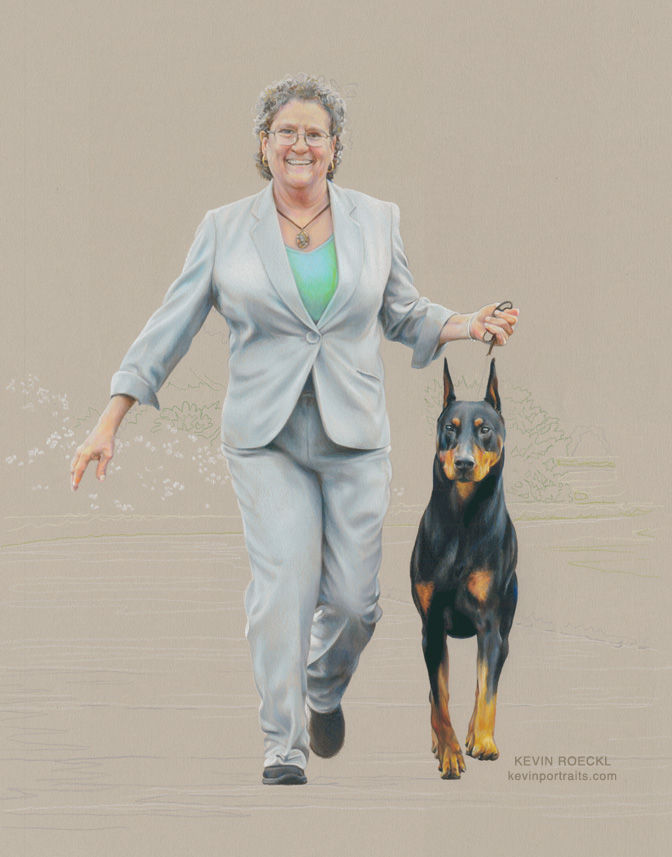
You can now see that this is a portrait of Gwen gaiting Kent straight at you.
Gwen & Kent portrait in progress 8
Figures finished. Tomorrow I’ll start on the background scene.
I always enjoy this stage, where the figures are finished and just floating against the background color.
Gwen & Kent portrait in progress 9
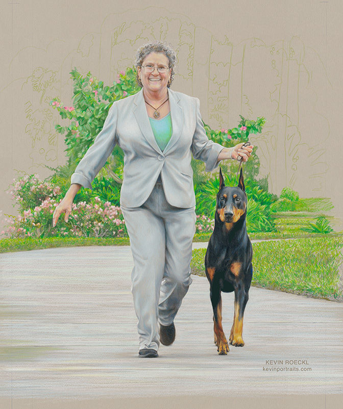
Laying in the background scene. Normally I start in the upper left and work down, so I’m not dragging my hand (right hand) through what I’ve already done. That’s how I did the figures. For the background scene I’ve started at the bottom of the artwork and worked up. Because I want to get the “values” just right - not too dark and not too light. Started with the bright sidewalk - slightly lighter than Gwen’s pants. Then the green lawns (naturally, since they are “connected” to the sidewalk). Then working upward into the flower beds past Gwen’s hips and making very sure that nothing is darker - or anywhere near as dark - as black Kent. Because I want him to be by far the darkest thing in the painting. You can see why: that makes him really pop out.

This is on the full sheet of paper. You can see the trim lines in the corners where I will trim it to the size the client commissioned. I always work on larger paper and trim it at the end. It may look nicer left as a full sheet. That’s an option I give the client at the end.
Now you can really see Gwen and Kent coming toward you out of the scene!
Gwen & Kent portrait in progress 10
Putting in a few more flowers and leaves around Gwen. I have to work carefully around her outline and Kent’s head. Then I’ll go fast n’ loose with bigger and bigger scribbly strokes as I go outward. Do you wonder why I work so tight and detailed on the portrait, and then get loose and scribbly as I work outward? There are several reasons for this portrait:
One is because the reference photo didn’t show as much of the scene as I included in the artwork — I don’t have those details to refer to. (Of course I could make them up, I’m capable of that.)
Another is because it adds more to the cost of a portrait when I fill every square inch with painstaking detail.
Another reason is that keeping the edges of the scene loose and foggy keeps attention centered on the figures.
And finally, here is a reason that applies to all of my work, not just this portrait: People often say my finished work “looks just like a photo”. People mean that as a compliment. But an artist doesn’t want their work to look JUST like a photo. Anybody with a camera can take a photo. Artists want their original creation to look like MORE than what a camera can do. They want it to look like it came from the hand of the artist. So a final reason to make the edges of the work loose and scribbly, with strokes that can only be made by my hand, no one else’s, is that it won’t look like a photo….it will look like an original work of art.
That is what makes this portrait “a Roeckl”.
Gwen & Kent portrait finished!
Big thanks to photographer Gay Glazbrook for a great reference photo to work from. In the original photo there were five tall, thin, palm-tree trunks in the background. All those vertical stripes were distracting so I took them out. Added a bit to both sides of the scene, but other than that, it’s exactly what Gay captured in the shot.

This portrait was commissioned for Gwen DeMilta as a surprise Christmas gift by a friend.


Comments