Shasta portrait in progress 13 - Color info for artists
- Kevin Roeckl
- Jul 27, 2024
- 2 min read
Filling in around Shasta’s head with a bunch of different greens.
There's some good color info in this post for artists!
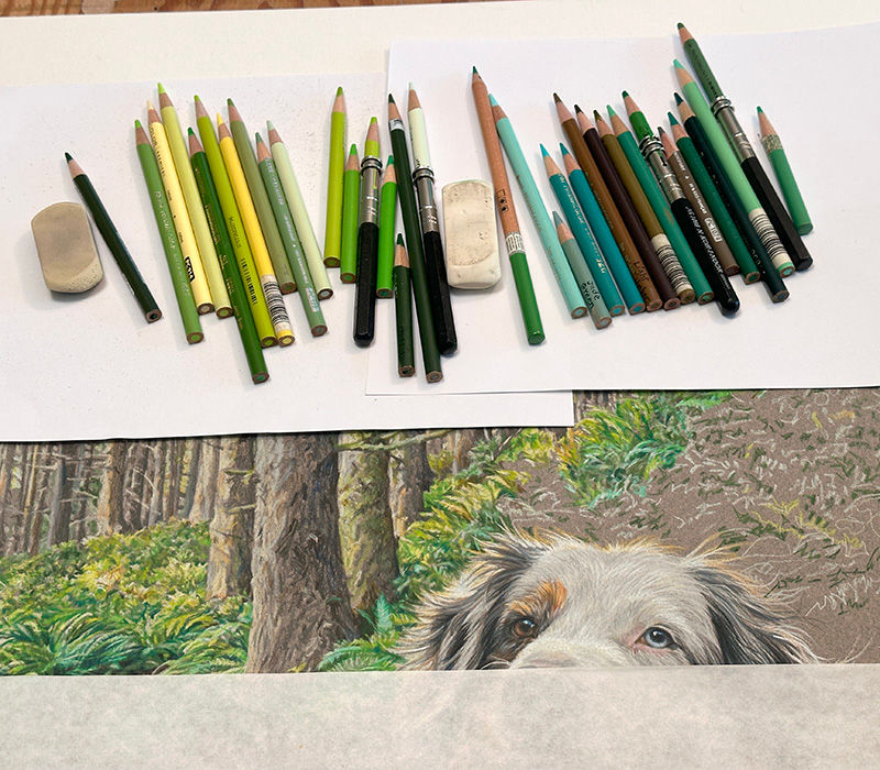
This photo taken in the studio shows some of the greens I’m using. Warm greens and cool greens. Many non-artists think of “green” as a cool color. (Red, for example, is considered a warm color.) If you’re not sure what the difference is between a “warm green” and a “cool green”, this pic shows it pretty clearly. Warm greens, on the left, have a lot of yellow, gold, or red in them — warm colors. Cool greens have a lot of blue - a cool color - in them. Cooler greens shade toward aqua (more and more blue). Warm greens shade toward chartreuse (more and more yellow).

In this close-up you can see some of the cool greens next to warm greens, in that section of completed leaves that is “floating” by itself to the right of Shasta’s head. The cool green leaves are in shadow, and the warm greens “behind” them (artistically, “around” them) are in sunlight. Sun is coming through the tree trunks in patches, lighting up some leaves and ferns but not others. Warm greens show where shafts of sunlight are hitting the forest floor. The ferns in shade are cooler greens. Colors in shade are always cooler.

Putting in the ferns is going more slowly than I expected. In my last post I shared how much it slowed me down working the colors of the background very carefully around the back-lit hairs of Shasta’s head. Shasta is the subject of the artwork, so I want her details to be as precise and perfect as possible.

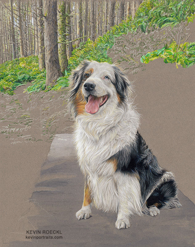
“Shasta”, an Australian Shepherd on a forest trail where she loves to hike with her beloved people.
Commissioned by Diane Barnes as a gift for her son Takeshi and his fiancé Cheryl.
🎨 Prismacolor pencil on grey Canson Mi-Teintes paper, with blue watercolor wash on the bridge.
20 x 26 inches


Comments