
Louie portrait in progress - start to finish
- Kevin Roeckl
- Oct 19, 2021
- 15 min read

August 23
I’ve started a new portrait for Dean Jalava.
It’s been a long process to decide among the thousands of photos Dean has of Louie (Louie is still alive and well at age 9)…the more than 100 favorite pics that Dean sent me. We’ve been talking about it for a year and I’ve given him tips and suggestions for getting that perfect shot of Louie for a portrait. Dean kept at it and periodically sent me very nice shots of Louie that he’d taken.

But in the end it was a totally unplanned photo that Dean took one golden morning while having coffee with his best friend Louie on their deck that was the “forever” memory. Isn’t that often the way it happens?
In our photo-choosing process Dean wrote:
“I know I said I wanted his face showing more … then I get that in newer photos, and now I’m complaining about his ears not being up enough…so it just kinda made me appreciate pic 3695 even more because it’s a real photo that I was lucky enough to catch while having my morning coffee with Louie out on my deck. It’s one of those photos I wasn’t trying to get for a portrait … it just happened. I think it will mean more to me to have a portrait like that. Louie was being himself in that photo. I’m 100% sure…not changing my mind…Golden morning coffee with Louie it is.”
So finally the decision was made.
After he approved my layout for the portrait, Dean said,
“I know years from now when I look at the portrait it will take me back to that morning on my deck having my coffee with Louie enjoying the morning sun.”
I replied:
“That’s exactly what I’m going for. That beautiful moment that will live in your heart forever. I have memories like that with my own dogs…specific moments when the sun was just right, and our partnership was perfection, that will live inside me until the day I die.”

The start of a very special portrait:
“Golden Morning Coffee with Louie”
This piece will capture the whole scene. I chose this “Bisque” Canson paper color to work on, because the red-golden color will imbue the whole painting with the warmth of that golden morning light that was shining on Louie. Dean asked me to write “Golden Morning Coffee with Louie” across the bottom of the portrait, and the date the photo was taken.
Here's a close-up of the first two days' work in the studio:

Working in the studio with the reference photo in front of me on the monitor, the colored pencils I'm using for Louie's face, and my color swatches on a scrap of the same "Bisque" Canson paper. My trusty electric pencil sharpener is sitting at the edge of this shot on the right.

Louie portrait in progress 2
This picture shows what Louie’s portrait looked like when I started work in the studio this morning.
When I quit work yesterday I had finished his nose, chin, and lip. The whole gold/orange part of his face has been outlined…”roped off” you could say, with the big open area of his muzzle and cheek all one big blank area. I still had studio time yesterday, but I wanted to do that area all at once. That’s a couple of hours' work and I knew I’d run out of studio time if I started that part. I didn’t want to break my momentum halfway through because that area takes a lot of concentration. Why?

This is the reference photo of Louie sent to me by Dean. To show you why that side of Louie’s face takes a lot of focus, I’ve extracted just that area from the photo. As you can see, it is all composed of yellows, golds, oranges, and shades of chocolate brown. Those are different colors than I’ve used so far in the black areas of Louie’s face.

When I focus on this area, in my mind I picture it floating alone on the paper color, like I’ve shown you here. An artist can mentally isolate an area like that to see what colors are really there.
The golds and oranges in this area are subtle. One color shades into the other without any obvious break between them. And all of the side of a dog’s muzzle is made up of abstract shapes….shapes that form his cheekbone, the curve of his jaw, the pad of flesh where the whiskers come out. It takes concentration to do one big interconnected area made up of so many odd, unusual, abstract shapes, and attend to the color changes between them, to make such a large area come out realistic: looking like the actual side of a dog’s face. When in reality it looks like this funny-looking orangey shape (collection of shapes). I have to maintain that concentration and focus on this odd blob of gold for two hours or more.
Below is how the artwork looks with that area finished. All I have to do is fill in that crescent shape on the side of Louie’s face with solid black.

Since I had all my pencil colors picked out for the gold/rust area, and I was on a roll, I continued on down his neck. This is how the portrait looked when I shut down the studio for today.
Louie’s portrait will show his whole body in a scene, but this would make a nice head-study just as it is.

Louie portrait in progress 3
Putting Louie’s body in, working down from the neck. These four photos taken in the studio show the progression as I'm working.
There is a lot of detail in the folds of his coat in this pose. And hundreds and hundreds of pencil strokes for the hairs.
1

2

3

4

Louie portrait in progress 4
Two pictures... I scanned the artwork before I started work this morning, and again when I finished.
Continuing work on Louie’s body….today his haunches.


I’m loving the way Louie looks on this “Bisque” Canson paper. It was the perfect choice for capturing “Golden Morning Coffee with Louie”.
Louie portrait in progress 5
Today I’m putting in the shapes of Louie’s chest.

I start by doing the black/shadowed areas first, to help guide me on the other shapes. The areas with the x’s in them are to remind me that those areas will be solid black, as I’m working out the lighter abstract shapes of his forechest - that helps me keep it all straight. I'll color in the solid black last.

Then it’s just a matter of putting in the light-colored pencil strokes first - the highlighted hairs, which is what you see here on the right half of his chest - then working darker, darker, darker to give it shape. You can see I’m adding the next-darkest grey on the right side of the chest. The 5 pencils you see show the progressively darker greys I’m using.
I work light-to-dark with the hairs of Louie’s black coat because light pencils over dark don’t work as well as dark over light - the lighter pencils just smear the darks around. Darker pencils cover the lights somewhat and darken them…so I have to allow for that by making the initial light strokes lighter than I want them to end up..

Now I’ve brought the shapes up to the darkest grey on the right half of the chest. The areas that will be solid black are now surrounded right up to their edges with the other grey. I want to keep my flow going with the lights and darks…at the end I’ll go back and fill in all the black areas by coloring really hard and solid with black pencil!
You can see that an area of Louie’s leg (his “knee”) on the left side of this pic is waiting for solid black too.

These are some of the other pencil colors I’m using in this portrait less often. I shove them to the side for when I need them…otherwise my entire portrait would be covered with pencils and I would never be able to find anything!

The finished result.
This jpg was made by scanning the actual artwork on my high-end scanner. That shows the richness and true color much better than pics taken in the studio with my phone.

Here’s the whole portrait so far. Lots of shapes and detail in Louie’s black coat lit by the early morning sun. You may remember that this will capture the sweet memory of “Golden Morning Coffee with Louie” forever for Dean. This portrait will have Louie in a full scene.

Louie portrait in progress 6
Sometimes these “in progress” posts are photos I take with my phone while working. Other times I scan the artwork to make a jpg. The client Dean asked what I mean by “scan” the artwork. Here's my answer:
You’ve probably seen scanners that you can buy to use with a computer. It has a flat glass surface, like a Xerox machine where you can put a piece of paper on the glass, close the lid, and the machine scans it to make a copy. Since I work on paper, I can put my original artwork on the scanner bed and scan it. It takes 8 separate scans to get the whole 20 x 26 inch portrait, which I then “stitch together” with Photoshop into one picture. That’s time-consuming so I don’t scan every day or while I’m working. In the meantime I take pics of my work in progress in the studio with my phone — you’ve seen those. But a phone doesn’t really capture the colors and the detail. I have a professional-quality scanner, and the scan captures every single little pencil stroke. Here’s a close-up to show you what I mean. It’s impossible to get this with a phone. You can even see how the golden-brown paper shows through the tiny gaps in the pencil strokes. That’s what will give this whole painting that "golden light” feeling that I want for Dean’s “Golden Morning Coffee with Louie” portrait.

WHY do I scan my artwork?
I want to have a record of every artwork I create: a high-quality digital picture, which I can use for marketing, to show to potential clients, etc. I have a record of every artwork I’ve done in my entire career. I used to do that by photographing each artwork with my camera before it went off to the client or gallery. That was before the days of personal computers. After I got a computer I bought a high-end scanner and figured out how to scan the artwork in pieces and “stitch them together” with Photoshop. That gives me a much higher quality picture of the original artwork than I could ever get with a camera. There is only one original, and it has a beauty (in person) - a vibrancy and luminosity - that can never come across in a picture (scanned or photographed). But with a high-quality scanner I can get as close as possible.
The next picture
shows Louie's wrist, partially finished, a small piece of the scan. This shows the incredible detail I can get with my scanner. Every little pencil stroke, even the roughness of the paper that makes those white pencil strokes near the top look “broken up”. I press harder when I’m doing his fur. Those white strokes were just done lightly to show me where the white part of the blanket is when I was working on his chest.

The reason I scan “in progress”
rather than only at the end is so I can share on social media and on my website and blog. Showing people the work in progress and talking about my technique has turned out to be the best way to connect with fans and potential clients. At first I didn’t think anyone would be interested in that. But my “in progress” posts have turned out to be quite popular. People really get pulled into the creative process. And the client loves being able to see their artwork taking shape day by day, instead of just waiting a month and me suddenly telling them, “It’s done.” So even though it’s a lot of work to scan them every few days, it’s worth it. I get a lot of enjoyment out of sharing my art with people, and the process I use to create it…I have such passion for what I do.
Louie portrait in progress 7
Louie is finished and I’ve drawn the outlines of his blanket. You may remember that this will capture the golden morning light of Dean having coffee with Louie on his deck...with Louie in a full scene.
I chose "Bisque" Canson paper to work on because this paper color will lend the rich warm glow of it's golden-brown color to the whole artwork. I'm using Prismacolor pencils; pencils are a "transparent" medium (little bits of the paper color show through the tiny gaps in the pencil strokes)...that's like mixing a little bit of this golden color with every pencil color I use.
A professional artist I knew when I was just starting my career as a gallery artist, worked in acrylic paint and he mixed a little bit of what he called "the mother color" with every color he used in a painting. That helps pull the entire artwork together and makes all the colors harmonious. The "mother color" for this one is the color of golden morning light.

Louie portrait in progress 8
I’m putting in the blanket colors. Notice I have yellows and oranges and browns on my “active pencils” sheet of paper and in the swatches that I use to guide me on the colors.
Dean asked me to write “Golden Morning Coffee with Louie” in a corner of the portrait, with the date he took the photo, enjoying morning coffee with his best friend.

A friend who saw this photo asked, "Did you write that lettering? Freehand?"
My answer:
I did it in Photoshop with a script font on the photo layout, then projected that onto the Canson paper and traced the lettering. So yes it was written by me, but no, not freehand!
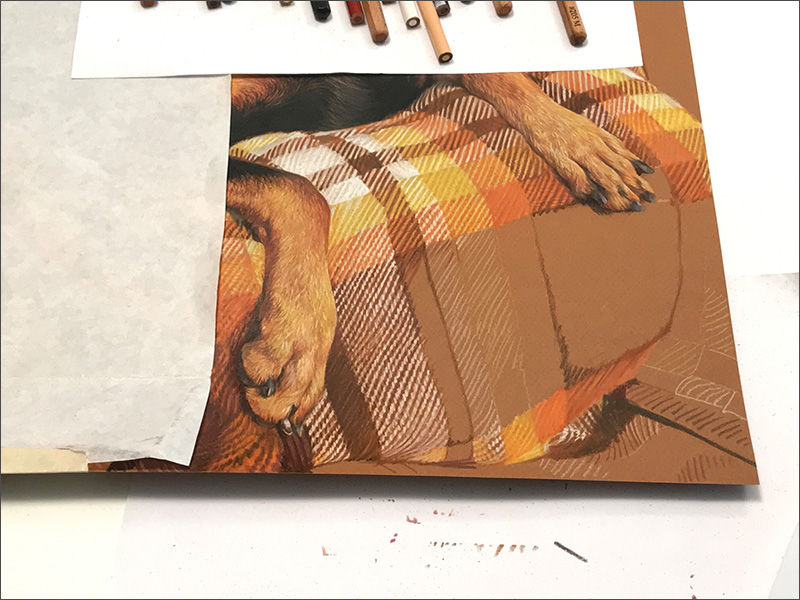
Louie portrait in progress 9
Filling in the squares of the blanket. It’s not going as quickly as I thought it would... I hadn’t really focused on the fact that every square in the plaid blanket is made up of stripes: two different colors.
I love the way these colors look on the “Bisque” (golden brown) Canson paper.
It’s hard to get good yellows with colored pencil on a darker paper. They just look brownish and dull. I have to first lay down white pencil, and then go over the exact same pencil stroke with the yellow

The whole portrait so far:

Louie portrait in progress 10
I finished the blanket today. I took this photo in the studio as I was getting down to the last part of the blanket, the lower left of the portrait.
The “tick marks” you see below the artwork are on a sheet of white paper I position under the edge of the artwork to catch my "overflow" pencil strokes that go off the edge when I'm working. That sheet of paper protects the illustration board that covers my worktable from getting all marked up.
Then I tape it up on the wall of my studio and make adjustments if I need to. I usually do that when I’m finished with the whole piece, but in this case I wanted to evaluate it before I start working on the background behind Louie.
I step back and look at the portrait from the distance that the client might see it hanging on the wall of their home. That gives me a different view of how it looks than when I’m bent over it at my work-table, with my eyes only about a foot from the artwork. After I stand back and evaluate it, I make adjustments if I need to….adjusting the color a little bit here and there, making some details lighter or darker or whatever needs to be done, until I’m satisfied with how it looks. The tape is a special masking tape called Drafting tape, which doesn’t damage the surface of paper when it’s pulled off.
Normally it would not be a good idea to have patterned wallpaper in an art studio. But the neutral colors and pattern of this wallpaper which was already there when I came, actually helps me see the artwork. I like it. The piece of "wall" you see on the right is a panel covered with that same wallpaper that I slide across a west-facing window to block the light when the sun comes around to that side in the afternoon. There is another window in the studio that faces north that provides light while I'm working (and I have overhead lights on the ceiling). "North light" is always considered the most ideal lighting for an art studio.
Louie's portrait is being done with Prismacolor pencils on "Bisque" Canson paper.
Louie portrait in progress 11
Coming into the home stretch on Louie’s portrait. I’m working on the wooden lattice behind Louie.
In this photo is a tool you don’t usually see in my art-studio shots: a drafting triangle. When I first started out as a professional artist at age 18 I was employed as a trainee at a Graphic Design/Advertising house. I learned to use drafting tools like a straight-edge, triangles, and Rapidograph pens to make perfectly straight, parallel, and perpendicular lines. That was long before the days of personal computers and digital design, when all layouts and paste-up had to be done by hand. I still have the tools I bought back then. Those tools and skills still come in handy to help me with straight lines and parallel lines, like the lattice of Dean’s deck behind Louie in this portrait.

I’m doing the lattice with a limited number of brown and beige pencil colors. I’m putting the pencil strokes onto the paper lightly because I want that golden-brown color of the Canson paper to be the main color of the background, and I don’t want any of the busy squares of this background to be as dense or dark as Louie or brighter than the highlights in his face.
The lattice pattern will fade out toward the top and sides of the artwork, so I’m having to use the pencil with the lightest touch I possibly can as I get farther out from Louie’s face. You can get a sense of that fade-out near the top of the artwork in the previous picture. I’m b-a-a-a-arely touching the paper with “Light Umber” brown pencil to do that horizontal plank across the top.

Louie portrait in progress 12
The slats of the lattice behind Louie are similar and repetitious, but they are not all the same. To keep track of which one I’m working on, I’ve added a black arrow to the reference photo on my monitor.

The wood grain and wear on each slat is different, and the light through the square gaps in the lattice are different. I glance up and down continually as I’m working to check what I’m copying in the reference pic. It can get confusing to get my eye back to the right slat or hole each time I look away. So I move the arrow to the next slat with my cursor as I work my way along. That helps me keep track of where I am, without having to search around with my eye to re-orient myself visually each time.

I glance up and down hundreds (maybe thousands) of times in a day’s work.
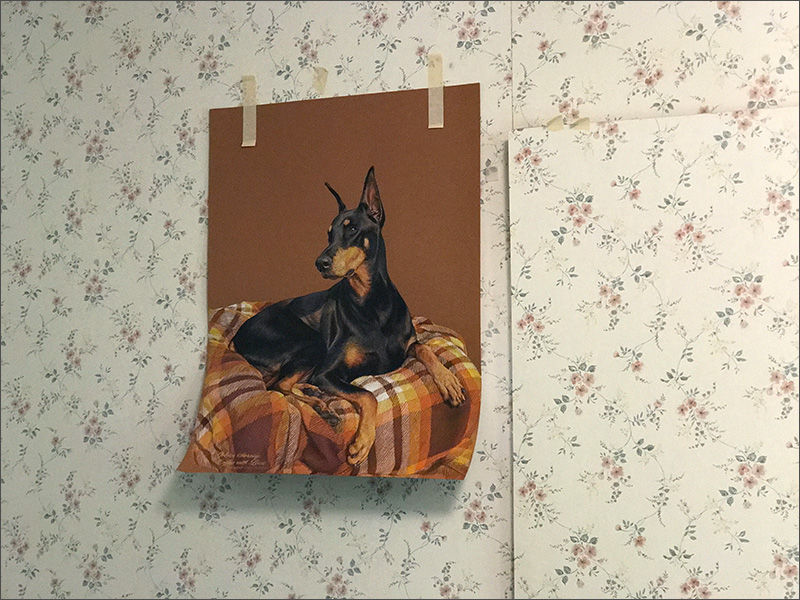
Louie portrait finished!
Finished portrait of Louie for Dean Jalava. Louie is still alive and well at age 9.
After Dean got on my portrait waiting list, we talked about the photos I would need. Dean has thousands of pics of Louie and over the past year sent me about 100 of his favorites. But none perfectly captured Louie the way Dean knows and loves him. When people look at a loved one, they see with their heart, not just their eyes. I gave him tips for getting that perfect shot. He kept at it and periodically sent very nice pics of Louie that he’d taken. He wanted Louie looking at him…he wanted the ears up more….nothing was exactly right. In the end it was a totally unplanned photo that Dean took one golden morning while having coffee with his best friend Louie on their deck that was “the one”.
It still took a while to hash through all the photos and narrow it down. Dean kept coming back to that shot. He wrote, ”It’s a real photo that I was lucky enough to catch while having my morning coffee with Louie out on my deck. It’s one of those photos I wasn’t trying to get for a portrait … it just happened. Louie was being himself in that photo. I know years from now when I look at the portrait it will take me back to that morning on my deck having my coffee with Louie enjoying the morning sun.”
Dean then asked if I could write “Golden Morning Coffee with Louie” across the bottom of the portrait, and the date the photo was taken.

I did this portrait with Prismacolor pencils. I chose “Bisque” Canson paper to work on, because the red-golden color permeates the whole painting with the warmth of that golden morning light. Because Dean’s photo was taken with a phone, which distorts objects (anything closer to the lens looks much bigger than it really is, like Louie’s front paws and the front of the blanket) I had to adjust those parts of the image to look like real life. The lattice behind Louie looked like it was leaning away from Louie, getting smaller at the right, and narrower at the top. Using some other shots Dean took on the deck as reference, I straightened the lattice, giving it upright, parallel lines, just as it is in reality. Dean and I discussed leaving the background a plain color (the color of the paper) but he wanted to capture the actual scene just as it was, with the shadow of Louie’s upright ears falling on the lattice behind him. In order to keep the portrait from being too busy with all the squares of the lattice and all the squares of the plaid blanket, I made the lattice very faint, using mostly the color of the “Bisque” paper so it doesn’t take away from the impact of Louie and the beautiful lines and colors of the blanket. I faded the lattice out at the top and sides so it’s there but doesn’t dominate the scene.
Before I start working on the face in a portrait I ask the client to tell me about them, so I can hold the essence of them and try to capture that in the portrait. Dean described a sensitive, very affectionate dog. A gentle dog who has never been in a fight, who loves the sun, loves to lay out and listen to the radio. Dean comes home at lunchtime to spend it with Louie. When Louie developed spinal problems Dean built a ramp and took his mattress off the box spring so they both sleep on the floor. Dean said,


Comments