
Storm portrait in progress 1
- Kevin Roeckl
- Mar 19, 2021
- 4 min read

Often my portrait clients are surprised how much is involved before I even touch a pencil to paper in the studio. This album describes the beginning steps of Storm’s portrait for Cathy Nearman.
To start off, the client sends me all the photos of their loved one they want me to see. I tell people:
Don’t worry about whether it ‘"looks like a portrait".
Just send any photos that speak to your heart.
Cathy sent more than 100 photos.
I don’t look too closely at each photo until I have everything in hand that they are going to send. I then study all the photos, and create a photo catalog where I arrange them in an order that makes sense to me, with colored labels. This screenshot shows the top 3 rows after I’ve arranged them. The red labels are my favorites, blue are secondary favorites that would also work for a portrait. Sometimes clients have a clear favorite photo, sometimes all the photos they send are their favorites!

The process of studying and arranging the photos
can take me a full day. By the time I get done I am as familiar with the photos as my client is. Those photos contain the essence of what they love. The first step in my process is seeing/feeling that emotion as fully as I can.
As I study the photos,
I am looking at each one with an artistic eye and visualizing it as artwork….thinking about the strategy I might use to turn that photo into a portrait, the steps and techniques it would require. Then I make suggestions to the client about the 4 or 5 photos that I think would work best: that would make the most beautiful artwork, capture the beauty and personality of their loved one the best…and also fit within the budget that client has. The client’s feedback to those initial suggestions will quickly zero in on one particular photo (or group of related photos) and the concept that is most meaningful to them. People who haven’t worked with me before are surprised at how much collaboration there is between me and them in this process. Sometimes it takes days of back and forth email conversation to gradually home in on the direction we will go.
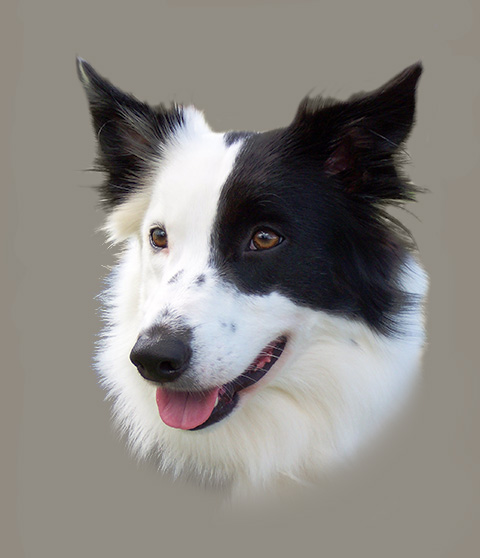
When Cathy sent all the photos of Storm, she didn’t tell me which were her favorites. After I sent basic suggestions based on those top 3 rows, she told me which was her clear favorite and why: “Storm is young in this photo..and it has so much sweetness in her expression, just how she really is.”. I moved that into the #1 spot (first on the left, top row) and told Cathy it would make a beautiful portrait.
Next I start playing around with the layout. What is the best way to take THAT photo, and turn it into a portrait?
I then send my client a layout I’ve created with Photoshop,
to give them an idea how the finished artwork will look. Usually there are more decisions to be made and the layout changed and adjusted, with my client’s feedback guiding me. That first layout is just the initial step. This is where my artistic expertise comes into play, and the client’s “loving heart” calls the shots. Now we are working as a team to create this portrait.
I emailed Cathy 4 versions of the initial layout, with captions to tell her my thoughts:
LAYOUT 1
I started out thinking it would be nice to have this portrait similar to a head study I did of Cathy’s “Robin” in 2016, shown on the left here. (Robin was Storm’s mother.) I began my Photoshop layout using Cathy's photo, on the same grey background, and just showing Storm’s head and her white neck ruff, like Robin’s portrait. That's Layout 1, on the right.


LAYOUT 2
But I didn’t think it was enough, just a short white ruff barely below her chin.
So I increased the space around her and showed more of her neck going down toward the chest. But because of the angle of the photo and the way she was standing with her head turned toward her shoulder, it shows the black that is on her shoulder, which makes it look like half of her forechest is black. That is not accurate, the front of her chest is white. I could change that black on the lower left to white, but I felt this layout could be better. It doesn’t yet have the dynamic feel that I want in a portrait — as though the subject is about to step out of the painting.

LAYOUT 3
As I was working with layout #2, which looks like half of her forechest is black, I knew that I would have to show more of her body in the portrait so it’s clear that her head is turned and the black area is on her side. I like this composition a lot better than just her head and ruff. The black body on the left and the lower white forechest in the lower right (which is in shadow and there is soft sunlight on her face) helps lead your eye up to her facial features. This gives a nice balance to the portrait and her head position makes more sense.

LAYOUT 4
Since I liked having more of her body and was very pleased with layout #3, I thought I would try it with some green grass behind her also. I like both #3 and #4, so it’s just a matter of personal preference.
#3 is very nice and makes Storm the total focus….all in black, white, and grey, except for her pink tongue and brown eyes. #4 adds additional color with the green.
Often I start with a basic idea (layout 1) and keep developing and building it, until I end up with the best result (layout 3 or 4). Sometimes I send only the final result to the client as my suggestion…sometimes I send all the versions in between. Any of these 4 layouts would work for a portrait. Those are my suggestions for Cathy, and she will tell me her preference.
At this point I also suggest sizes for the portrait and quote prices for each version based on size. I suggested 16 x 20 inches for version 3 or 4, and smaller for version 1 or 2. That helps the client consider cost in which version they choose.


Comments